A June snowstorm just topped off the already thick layer of white stuff atop the Sierra Nevadas. California’s snow water equivalent rose to a heaping 170 percent of normal. But not so long ago, the state was in the midst of a deep drought; its mountains were bare and brown, and water levels plummeted in reservoirs.
Throughout, satellites were watching. Check out the California drought and its aftermath in a video from NASA Earth Observatory:
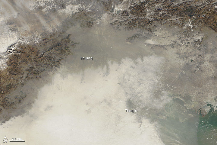
Haze over northeastern China on January 14, 2013. Image by NASA Earth Observatory, using data Terra MODIS data from LANCE MODIS Rapid Response.
In the winter of 2013, thick haze enveloped northern China for several weeks. On January 12, 2013, the peak of that bad-air episode, the air quality index (AQI) rose to a staggering 775—off the U.S. Environmental Protection Agency scale—according to a U.S. air quality sensor in Beijing.
Extra pollution from cars, homes, and factories in the winter often sets the stage for outbreaks of air pollution in China. But a March 2017 study in Science Advances suggests that a loss of Arctic sea ice in 2012 and increased Eurasian snowfall the winter before may have helped fuel the extreme event.
Snow and ice cover can affect weather patterns because both affect albedo, a measure of how much solar radiation the surface reflects in comparison to how much incoming solar radiation it receives. In September 2012, sea ice covered less area than at any other time since 1979. Meanwhile, Eurasia had unusually high snow cover in December 2012, the second most on a record that dates back to 1967.
Normally, winds blow air pollution away from eastern China, which is home to Beijing and several other large cities. But in January 2013, winds died down to a whisper and air pollution piled up. By analyzing decades of data collected by ground-based weather stations, 15 years of satellite data on aerosols, and computer simulations of the atmosphere, the researchers concluded that unusual sea ice and snow conditions triggered a shift in China’s winter monsoon, stilling the winds that normally ventilate Beijing.
A press release from Georgia Tech explained the connection in more detail:
“The reductions in sea ice and increases in snowfall have the effect of damping the climatological pressure ridge structure over China,” explained Yuhang Wang. “That flattens the temperature and pressure gradients and moves the East Asian Winter Monsoon to the east, decreasing wind speeds and creating an atmospheric circulation that makes the air in China more stagnant.”
If correct, this might explain why efforts to reduce air pollution in recent years have not stopped extreme haze events from happening. “Emissions in China have been decreasing over the last four years, but the severe winter haze is not getting better,” said Wang. “Mostly, that’s because of a very rapid change in the high polar regions.”
This is not the first study that connects changes in the Arctic to severe haze in China. Research published in August 2015 in Atmospheric Oceanic Science Letters argued that a decline in Arctic sea ice intensifies haze in eastern China. And a study published in Nature Climate Change in April 2017 came to a similar conclusion. The latter study projected a 50 percent increase in the frequency of extreme haze events and an 80 percent increase in their persistence in the near future.
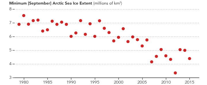
In 2012, Arctic sea ice extent was unusually low in September. New research suggests that may have contributed to a bad haze outbreak in eastern China the next winter. (NASA Earth Observatory graph by Joshua Stevens, based on data from the National Snow and Ice Data Center.)
Decades or even centuries from now, when enough time has passed for historians to write definitive accounts of global warming and climate change, two names are likely to make it into history books: Syukuro Manabe and Richard Wetherald.
In the late-1960s, these two scientists from the Geophysical Fluid Dynamics Laboratory developed one of the very first climate models. In 1967, they published results showing that global temperatures would increase by 2.0 degrees Celsius (3.6 degrees Fahrenheit) if the carbon dioxide content of the atmosphere doubled.
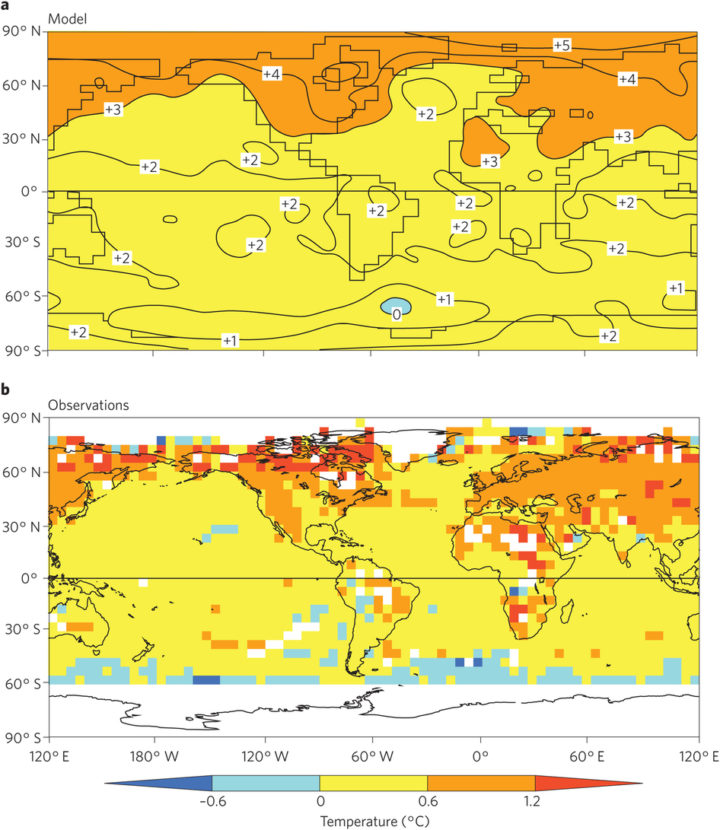
The top map shows temperature changes in one of Manabe’s coupled atmosphere–ocean models. It depicts what would happen by the 70th year of a global warming experiment when atmospheric concentrations of carbon dioxide are doubled. The model’s predictions match closely with levels of warming observed in the real world. The lower image shows observed change from a 30-year base period around 1961–1990 and 1991–2015. The map was obtained using the historical surface temperature dataset HadCRUT4. Figure published in Stouffer & Manabe, 2017.
As Ethan Siegel pointed out in Forbes, carbon dioxide content has risen by roughly 50 percent since the pre-industrial era. Observed temperatures, meanwhile, have increased by 1°C (1.8°F). For a pair of scientists working in a time when computer instructions were compiled on printed punch cards and processing was thousands of times slower than today, they created a remarkably accurate model. That is not to say that Manabe claims his 1967 model is perfect. In fact, he is quick to point out that there are some aspects that his and other climate models still get wrong. In an interview with CarbonBrief, he put it this way:
Models have been very effective in predicting climate change, but have not been as effective in predicting its impact on ecosystem[s] and human society. The distinction between the two has not been stated clearly. For this reason, major effort should be made to monitor globally not only climate change, but also its impact on ecosystem[s] through remote sensing from satellites as well as in-situ observation.
There is a great deal of fascinating detail about Manabe and Wetherald’s model and the early history of climate modeling that do not fit into a short blog post. If you want to learn more, this section of Spencer Wirt’s the History of Global Warming is well worth the time. The American Institute of Physics has also posted a Q & A with Manabe that covers his 1967 paper, which is considered one of the most influential in climate science. And in March 2017, Manabe and colleague Ronald Stouffer authored a commentary that was published in Nature Climate Change. The Independent also has a good article about this.
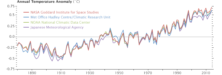
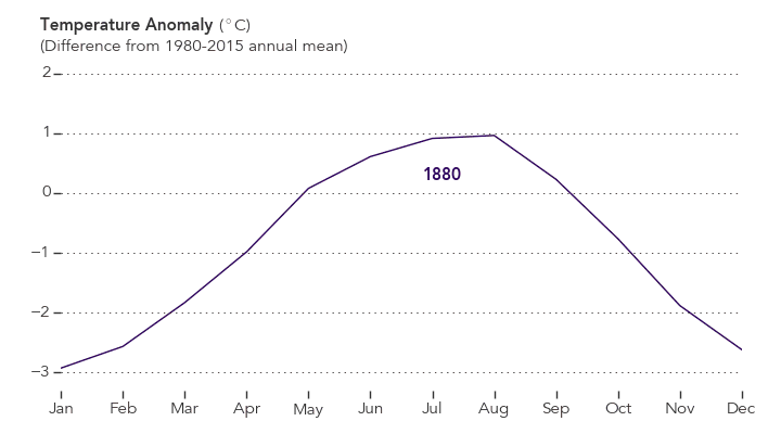
This line plot shows yearly temperature anomalies from 1880 to 2014 as recorded by NASA, NOAA, the Japan Meteorological Agency, and the Met Office Hadley Centre (United Kingdom). Though there are minor variations from year to year, all four records show peaks and valleys in sync with each other. All show rapid warming in the past few decades, and all show the last decade as the warmest. Read more about this chart.

At the time of his death on December 23, 2016, Piers Sellers was the deputy director of the Sciences and Exploration Directorate and the acting director of the Earth science division at NASA’s Goddard Space Flight Center. But he was a lot more than that to his colleagues and to the world. NASA science writer Patrick Lynch (and occasional Earth Observatory contributor) had the unenviable task of trying to capture the essence of Sellers:
“As an astronaut, he helped build the International Space Station. As a manager, he helped lead hundreds of scientists. And as a public figure he was an inspiration to many for his optimistic take on humanity’s ability to confront Earth’s changing climate. But his most lasting contributions will be in the field where he began his career: science.”
Piers came to NASA Goddard from Britain in 1982 as a research meteorologist and climate scientist. His focus was the interaction between the biosphere — the living, breathing plant-life of Earth — and the atmosphere. He helped develop models and wrote several papers that are still widely cited in the field. But he also had another lifelong dream: to become an astronaut. He applied to the astronaut training program in the 1990s, and worked through rigorous screening and training to go into space. He flew to the International Space Station in 2002, 2006, and 2010, participating in six spacewalks and helping with assembly of the station. Upon retiring from the astronaut corps, he came back to Goddard and resumed his place as a leader in Earth science, while also promoting conversations and collaborations with researchers studying planetary science and hunting for life beyond our solar system.
I did not have the chance to get to know Piers well. He was someone I mostly watched from afar and our interactions were sporadic, though always interesting, dignified, and thoughtful. I came to know him mostly through his words — to the media and to my fellow scientific and communications staff of NASA Goddard — and in the ways he inspired people. The more I read, the more I wish I had been able to spend more time with him.

In January 2016, one year ago this week, he wrote a poignant op-ed in The New York Times. The words were a compelling prelude to his final year with us.
I’m a climate scientist who has just been told I have Stage 4 pancreatic cancer. This diagnosis puts me in an interesting position. I’ve spent much of my professional life thinking about the science of climate change, which is best viewed through a multi-decadal lens. At some level I was sure that, even at my present age of 60, I would live to see the most critical part of the problem, and its possible solutions, play out in my lifetime. Now that my personal horizon has been steeply foreshortened, I was forced to decide how to spend my remaining time. Was continuing to think about climate change worth the bother?
You should read the full text of “Cancer and Climate Change” for its insight and inspiration.
*******************************************
In the summer of 2016, Sellers wrote another compelling piece, this time in The New Yorker. In “Space, Climate Change, and the Real Meaning of Theory,” he took on a very sensitive and fundamental facet of science: the accumulation of evidence and observation that leads to truth. Here is my favorite passage:
When we talk about why the climate has changed, and what the future climate is likely to be, scientists use analyses and predictions that rest heavily on results from computer models, which in turn rest on layers and layers of theory. And there’s the rub—a lot of the confusion about what is known and unknown about the changing climate can be traced to people’s understanding of the role of theory in science.
Fundamentally, a theory in science is not just a whim or an opinion; it is a logical construct of how we think something works, generally agreed upon by scientists and always in agreement with the available observations. A good example is Isaac Newton’s theory of gravitation, which says that every physical object in the universe exerts a gravity force field around itself, with the strength of that field depending on its mass. The theory—one simple equation—does a superb job of explaining our observations of how planets orbit around the sun, and was more than good enough to make the calculations we needed to send spacecraft to the moon and elsewhere. Einstein improved on Newton’s theory when it comes to large-scale astronomical phenomena, but, for everyday engineering use, Newton’s physics works perfectly well, even though it is more than three hundred years old.
…Engineering theory, based on Newton’s work, is so accepted and reliable that we can get it right the first time, almost every time. The theory of aerodynamics is another perfect example: the Boeing 747 jumbo-jet prototype flew the first time it took to the air—that’s confidence for you. So every time you get on a commercial aircraft, you are entrusting your life to a set of equations, albeit supported by a lot of experimental observations. A jetliner is just aluminum wrapped around a theory.
The full text is here.
**************************************************
On camera, it is easy to pick up the energy, humor, and dignity of the man. In the past year, he was a frequent interview subject for the television and radio media. He also made an appearance in Leonardo DiCaprio’s documentary Before the Flood. Some of us think Piers stole the show.
But I am most fond of this simple video, posted last month to YouTube. It’s a conversation between Piers and Compton Tucker, one of his best friends, his next-door neighbor, and a fellow NASA scientist. So many people have stilted and distant impressions about scientists, and Hollywood caricatures don’t help. I like this video because it shows bright people having fun, being human, and savoring life, learning, and friendship.
Other interviews worth watching or listening to:
WBEZ Chicago — The Thin Blue Ribbon
HBO Vice News – A New Hope
CNN On GPS: An astronaut on his final mission
**************************************
At the conclusion of his January 2016 piece in The New York Times, Piers offers a thought that inspires us to keep up the good work.
As for me, I’ve no complaints. I’m very grateful for the experiences I’ve had on this planet. As an astronaut I spacewalked 220 miles above the Earth. Floating alongside the International Space Station, I watched hurricanes cartwheel across oceans, the Amazon snake its way to the sea through a brilliant green carpet of forest, and gigantic nighttime thunderstorms flash and flare for hundreds of miles along the Equator. From this God’s-eye-view, I saw how fragile and infinitely precious the Earth is. I’m hopeful for its future.
And so, I’m going to work tomorrow.

NASA Profile – Piers Sellers: A Legacy of Science
NASA Statement – NASA Administrator Remembers Scientist, Astronaut Piers Sellers
Flickr: Piers Sellers
The Washington Post — Piers Sellers, climate scientist turned astronaut, dies at 61

View of the dais during the High-Level Segment Ministerial Round Table ‘Towards an Agreement on the HFC Amendment under the Montreal Protocol – Part 2: Ensuring Benefits for All.’ October 14, 2016 (day 6). Photo by IISD/ENB | Kiara Worth
The Antarctic ozone hole in 2016 was not exactly remarkable. But each year, we publish an annual update because, when strung together over time, the series shows the unparalleled success of the Montreal Protocol in stabilizing the atmosphere.
Now the scientists and negotiators behind the Protocol are taking on a new problem: the climate warming effects of chemicals that were supposed to be better for the ozone layer. NASA scientist Paul Newman attended the Montreal Protocol’s international meeting this October in Kigali, Rwanda, and he sat down with us to explain the new agreement, why it’s unique, and what it was like to participate in the meeting. Here are some of the main takeaways:
“The Montreal Protocol is written so that we can control ozone-depleting substances and their replacements. Chlorofluorocarbons (CFCs) were initially replaced with hydrochlorofluorocarbons (HCFCs) and then hydrofluorocarbons (HFCs), making HFCs the so-called “grandchildren” of the Montreal Protocol.
HFCs very weakly affect the ozone layer. But the problem is that they are powerful greenhouse gases. One can of this keyboard cleaner [an aerosol can with HFC-134a] is equivalent to 1,360 cans of carbon dioxide. HCFs are much more powerful than carbon dioxide as a greenhouse gas, and that’s true of many HFCs, not just HFC-134a. And their use—particularly in refrigeration and air conditioning—has been going up fast.
It has been projected that by 2100, the effect of HFCs on temperature could be as high as 0.5 Kelvin (0.5 degrees Celsius, or 0.9 degrees Fahrenheit) if we did nothing. Because of the amendment, that number will be closer to 0.06 Kelvin (0.06 degrees Celsius, or 0.11 degrees Fahrenheit).
The point of the of Kigali amendment was to control these greenhouse gases because they are a replacement for CFCs. They are adding to the climate problem, so the world’s nations wanted to do something about it. The Montreal Protocol has evolved from strictly an ozone treaty, to an ozone and climate treaty.”

NASA scientist Paul Newman (right) on October 10, 2016 (day 2). Photo by IISD/ENB | Kiara Worth
“HFCs go through a series of steps before they can begin accumulating in the atmosphere. The first is production, in which factories make tanks of the gas (like a brewery making big vats of beer). The next step is consumption, when HFCs are added to things like refrigerators and air conditioners (to follow the beer analogy, that’s when the brewer puts the beer in a bottle or keg). Finally, HFCs are emitted when people use those things (pop the cork on the bottle or tap the keg).
The important point is that there is a time lag. Consumption of HFCs are projected to peak in the late 2020s, but emissions don’t peak until about 2035. Once in the atmosphere, HFCs last a long time before being destroyed by chemical reactions. For example, If I vent my can of 134a, 5 percent of it will still be in the atmosphere after 42 years. So they continue to accumulate and peak in the atmosphere by the mid 2050s.”

Delegates during the morning plenary on October 11, 2016 (day 3). Photo by IISD/ENB | Kiara Worth
“Montreal Protocol meetings don’t have a schedule; they have an agenda. That means that we have a list of topics and we work until they are all addressed. For example, we worked all day Friday (October 14, 2016) but didn’t finish, so we reconvened Saturday at 1 a.m. and finished the amendment at 7 a.m. I was up for 27 straight hours, tired and hungry.”
… but uniquely effective.
“This agreement is a huge step forward because it is essentially the first real climate mitigation treaty that has bite to it. It has strict obligations for bringing down HFCs, and is forcing scientists and engineers to look for alternatives.
The Montreal Protocol is also technically the perfect mechanism for dealing with these issues. The technology people, economics people, science people, chemical manufacturers—they have all worked through the Montreal Protocol and are fully capable of dealing with refrigerants like HFCs and their alternatives.
The agreement wouldn’t go forward without a pretty good idea about what those replacements might be. Hydrofluoroolefins, for example, have a really tiny climate impact and only 10-day lifetimes and are already being used in some applications. The Montreal Protocol is pro-engineering, pro-technology, and very different than any other treaty. We can solve our environmental problems—that is the power of a technological society.”
September 2016 was the warmest September in 136 years of modern record-keeping, according to a monthly analysis of global temperatures by scientists at NASA’s Goddard Institute for Space Studies (GISS) in New York.
NASA Earth Observatory chart by Joshua Stevens, based on data from the NASA Goddard Institute for Space Studies.
September 2016’s temperature was a razor-thin 0.004 degrees Celsius warmer than the previous warmest September in 2014. The margin is so narrow those two months are in a statistical tie. Last month was 0.91 degrees Celsius warmer than the mean September temperature from 1951-1980.
The record-warm September means 11 of the past 12 consecutive months dating back to October 2015 have set new monthly high-temperature records. Updates to the input data have meant that June 2016, previously reported to have been the warmest June on record, is, in GISS’s updated analysis, the third warmest June behind 2015 and 1998 after receiving additional temperature readings from Antarctica. The late reports lowered the June 2016 anomaly by 0.05 degrees Celsius to 0.75.
“Monthly rankings are sensitive to updates in the record, and our latest update to mid-winter readings from the South Pole has changed the ranking for June,” said GISS director Gavin Schmidt. “We continue to stress that while monthly rankings are newsworthy, they are not nearly as important as long-term trends.”
The monthly analysis by the GISS team is assembled from publicly available data acquired by about 6,300 meteorological stations around the world, ship- and buoy-based instruments measuring sea surface temperature, and Antarctic research stations. The modern global temperature record begins around 1880 because previous observations didn’t cover enough of the planet. Monthly analyses are updated when additional data become available, and the results are subject to change.
Related Links
+ For more information on NASA GISS’s monthly temperature analysis, visit: data.giss.nasa.gov/gistemp.
+ For more information about how the GISS analysis compares to other global analysis of global temperatures, visit:
http://earthobservatory.nasa.gov/blogs/earthmatters/2015/01/21/why-so-many-global-temperature-records/
+ To learn more about climate change and global warming, visit:
http://earthobservatory.nasa.gov/Features/GlobalWarming/
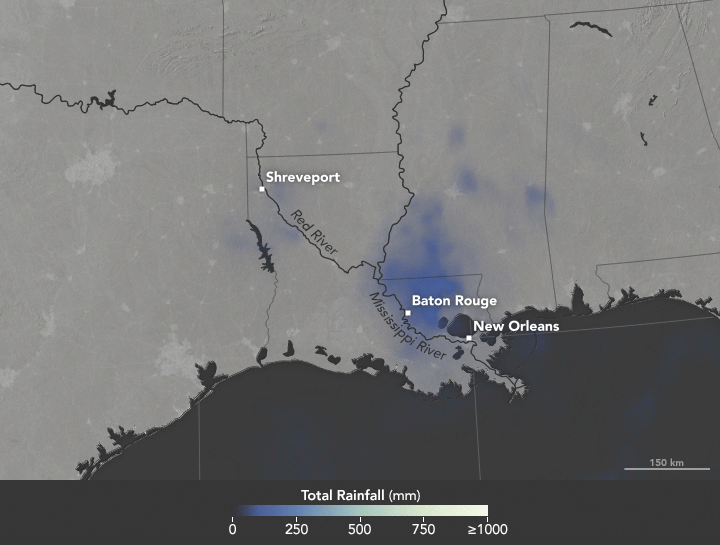
Heavy rains fell on Louisiana in August 2016, causing record-high crests for a number of rivers in the area. Map by Joshua Stevens/NASA Earth Observatory.
In the United States, we say “it’s raining cats and dogs” when we get a heavy downpour. In South Africa, it rains “women with clubs.” In Slovakia, a good soak means “tractors are falling.”
World languages brim with rainy day idioms. But when it comes to describing copious amounts of wet stuff, meteorologists do not encourage wordplay. Researchers are particularly adamant about one expression that does not work: the “rain bomb.”
The summer of 2016 brought extreme rain to multiple parts of the U.S., taking lives and causing billions in property damage. In July, thunderstorms dumped more than six inches of rain on Elicott City, Maryland in roughly two hours, causing flash floods that upended cars and lives. In May, nearly eight inches of rain fell in two days, among a series of heavy rains to inundate Texas. Most recently in Louisiana, more than 30 inches of rain fell in three days, stranding 20,000 people and killing nine.
The Louisiana storm didn’t meet the criteria of a tropical depression as defined by the National Hurricane Center: a tropical cyclone in which the maximum sustained surface wind speed is 38 miles per hour (62 kilometers per hour) or less. In another instance of precise wording, 2012’s Hurricane Sandy technically ceased to be a “hurricane” a few hours before it made landfall, turning into a “post-tropical cyclone.”
For some in the media, “tropical depression” lacks pizzazz and conviction. It lacks the visceral pelting of tractors falling out of the sky or of women with clubs beating down on the Earth. Some news organizations referred to the Louisiana event as a rain bomb. So what should we call severe rain?
NASA scientists George Huffman and Owen Kelley parsed some of the commonly-used rain terminology.
For one, there’s the “rain shaft.” A rain shaft is a centralized column of precipitation—not necessarily heavy rain. “The rain shaft […] is any rain event, no matter how modest or foreboding, that can be seen stretching from the cloud to the ground,” wrote Huffman, a research meteorologist at NASA’s Goddard Space Flight Center.
Then, there are “microbursts.” These are severe wind events caused by a “small column of exceptionally intense and localized sinking air that results in a violent outrush of air at the ground,” according to AccuWeather. Microbursts are smaller than 2.5 miles (4 kilometers) in size.
Be careful of mixing rain shafts with microbursts, Huffman cautioned.
“Just as you don’t have a microburst with every rain shaft, you don’t necessarily have an identifiable rain shaft with every microburst,” wrote Huffman in an email. “The really interesting dynamics of microbursts are a bit rare, and frequently not present in flooding rains.”
There’s also a size distinction between the different systems, NASA scientists said. A rain shaft comes out of an individual convective cell, making it roughly five to ten kilometers across. (By contrast, tropical depressions measure roughly 100 to 500 kilometers across.)
But in some cases, like Louisiana’s, the term “tropical depression” works, said Owen Kelley. “You don’t need to appeal to rain shafts, microbursts, or rain bombs to explain this system,” Kelley wrote in an email. The storm in Louisiana was “just a plain-old tropical depression that got stuck in one place for several days in a row and therefore dumped a lot of rain in one place.” That weather system did display some of the common signs of a tropical system. For instance, Huffman notes that it had low pressure at low and middle altitudes, and high pressure at the top, “implying some degree of warm core.” (Mid-latitude systems have a cold core, with the most negative pressure deviation at the system’s top.)
Researchers agree, though, about one term, “rain bomb,” which appeared in a couple of articles this summer in reference to extreme rainfall events. Don’t use it, scientists said. While it makes for a catchy headline, “rain bomb” is not an established meteorological term.
For extreme rain, Kelley suggested yet another phrase: “vigorous convective cells.” These severe rainstorms can take on various forms: super-cells, squall lines, isolated cells.
Microbursts, rain shafts, vigorous convective cells. At the end, isn’t it all just wet stuff coming out of the sky? Yes and no, scientists say. Terms used to describe extreme rain should be used with an eye on precision. As extreme rains (and extreme weather, in general) become more frequent, so will the terms we use to describe them.
While I was interviewing University of North Carolina climate scientist Wei Mei about his new research that shows a significant increase in the intensity of land-falling typhoons in the western Pacific, the strongest storm of the 2016 season (Super Typhoon Meranti) was on the verge of slamming into China after grazing Taiwan.
“Meranti fits the trend,” said Wei. “In 2016 so far, there have been six typhoons in the northwestern Pacific. Three have already made it to category 4 or 5. In the late 1970s, only about one-quarter of typhoons reached that strength. Now about half do.”

NASA Earth Observatory MODIS image of Super Typhoon Meranti.
Some meteorologists have mused that with sustained winds of 165 knots (190 miles per hour), Meranti would have been the equivalent of a Category 6 storm—if the Saffir-Simpson scale actually went that high. (It maxes out at 5). Even though Meranti only grazed southern Taiwan, it still knocked out power to 500,000 households and produced giant waves along the coast.
The focus of Mei’s research, however, is not Meranti or the 2016 typhoon season. Working with colleague Shang-Ping Xie of Scripps Institution of Oceanography, Mei has been digging through records that detail every typhoon in the northwestern Pacific since 1977 and looking for changes in the intensity of storms. What they found was a strong increase in typhoon intensity. Overall, landfalling storms strengthened by about 15 percent over the past four decades, with the proportion of typhoons reaching categories 4 and 5 more than doubling. Mei and Xie showed that storms that passed over waters relatively near to land and moved toward land (red and green dots in the chart below) have strengthened the most. Those that stayed out over the open ocean (black and blue dots) did not strengthen by a significant amount.
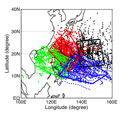
Figure from Mei and Xie, 2016.
“Elevated rates of warming in coastal seas (in comparison to the open ocean) are the reason for the intensification of land-falling typhoons,” said Mei. Between 1977 and 2013, many coastal areas in Asia have warmed by upwards of 0.20 degrees Celsius (0.36 degrees Fahrenheit) per decade along the coasts—more than twice as much as open ocean areas. In the chart below, notice all the deep reds (more warming) near the coasts; farther out to sea tends to be yellow and orange (less warming).
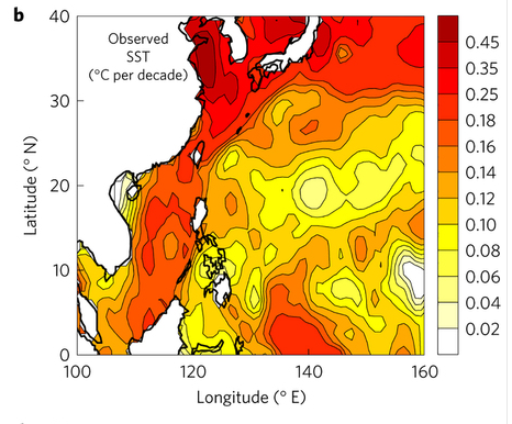
Figure from Mei and Xie, 2016.
“We are not arguing that the warming of the coastal seas is due to greenhouse gas-driven climate change; that would require attribution studies that we have not conducted yet,” he said. “But we feel confident that land-falling storms are getting stronger because of rising sea surface temperatures, particularly in a band off the coast of East and Southeast Asia.” A related 2015 study led by Mei argued that sea surface temperatures are a more important factor in controlling long-term variations in typhoon intensity than other factors, such as vertical wind shear.
In this study, Mei and Xie did not look at the frequency of storm development. Some storm researchers have argued that a warming world may make hurricanes and typhoons stronger but less frequent.
For more details about Mei and Xie’s latest study, read more from Scripps Institution of Oceanography, The Verge, and Nature Geoscience.

Himawari-8 image of Super Typhoon Meranti and night lights (in orange) of Asia via Colorado State University and Mashable.

(Image by NASA Earth Observatory)
Though blizzards and cold snaps may have made you forget the news from last week, 2015 was the warmest year in NASA’s global temperature record, which dates back to 1880. During a January 2016 press conference (see the slides here), Gavin Schmidt, director of NASA’s Goddard Institute for Space Studies, explained that 2015 was 0.87 degrees C (1.57°F) above the 1951-80 average in the GISS surface temperature analysis (GISTEMP), one of four widely-cited global temperature analyses.
The statistical record is notable, but keep in mind that this year is just part of a much longer story about the climate. If you want to learn more about climate science as a whole rather than just the latest headlines, here are a few resources that you may find informative. The list is not comprehensive (and we are open to more suggestions), but it is a useful starting point for understanding climate science.

(Image by Eric Roston and Blacki Migliozzi for Bloomberg Business)
The plot above comes from an interactive graphic called “What’s Really Warming the World?” Put together by Eric Roston and Blacki Migliozzi of Bloomberg News (with assistance from NASA climatologists Gavin Schmidt and Kate Marvel), the chart does an excellent job of breaking down the various factors (greenhouse gases, aerosols, solar activity, orbital variations, etc.) that affect climate. It parses out visually how much each factor contributes. The bottom line: greenhouse gases are absolutely central to explaining global temperature trends since 1880. The screenshot above hints at what the interactive looks like, but I highly recommend heading over to Bloomberg to see the full graphic.
Another invaluable graphic for understanding climate change is the “radiative forcing bar chart” below. (You can read an interesting post by Schmidt that explains how these charts have evolved over the decades). At first glance, the chart from the fifth assessment report by the United Nations’ Intergovernmental Panel on Climate Change may seem technical and difficult to understand. It is. But it is well worth looking up the technical terms.

(Image by the IPCC for the WG1AR5 Summary for Policy Makers)
In short, you are looking at a balance sheet of the major types of emissions that have either a warming or cooling effect on climate. Bars that extend to the left of the 0 signify a cooling effect; bars that extend to the right signify warming. The longer the bar, the more warming or cooling a given type of emissions contributes. What becomes immediately obvious is that carbon dioxide (CO2) and methane (CH4) have the biggest warming influence by far. The other well-mixed greenhouse gases — halocarbons, nitrous oxide (N20), chlorofluorocarbons (CFCs), and hydrochlorofluorocarbons (HCFCs) play a much smaller role.
The situation gets messy when you look at the role that short-lived gases and aerosols play. Some gases like carbon monoxide (CO) and the non-methane volatile organic compounds (NMVOC) — such as benzene, ethanol, formaldehyde — contribute to warming, but not much. Others like NOx actually slightly cool the climate overall if you consider how these gases interact with other substances in the atmosphere. Things get even messier if you look at aerosols. Mineral dust, sulfate, nitrate, and organic carbon have a cooling effect. On the other hand, black carbon causes warming. Albedo changes due to land use and changes in solar irradiance are minor in comparison to the other factors.
That’s a lot of variables, but one reason I like this chart is the error bars and the “level of confidence” column. The error bars give you a sense of how much uncertainty there is when it comes to the effects of various emissions. Look at the aerosol section, for instance, and you will see that the error bars are quite large and there is still some uncertainty about how aerosols affect clouds. The level of confidence column offers further clues to what scientists understand well and which areas they are less confident about. VH stands for very high confidence; H stands for high confidence; M stands for medium confidence; and L stands for low confidence.
What is striking is that even when you account for the error bars, there is little doubt that carbon dioxide and methane are warming the climate.
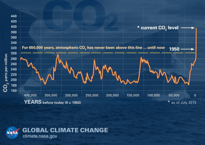
(Image by the NASA Global Climate Change website)
A third graphic, produced by NASA but based on data described here, is particularly compelling. Based on atmospheric information preserved in air bubbles in ancient ice cores, the plot offers a view of carbon dioxide levels in Earth’s atmosphere for the past 400,000 years. As this graph makes obvious, it has been a long time since carbon dioxide levels have been anywhere near where they are now.
For a much more recent view of carbon dioxide levels, the animation above is useful. Produced by NASA’s Scientific Visualization Studio, the video shows a time-series of the distribution and concentration of carbon dioxide in the mid-troposphere, as observed by the Atmospheric Infrared Sounder (AIRS) on the Aqua spacecraft. For comparison, the fluctuations in AIRS data is overlain by a graph of the seasonal variation and interannual increase of carbon dioxide observed at the Mauna Loa observatory in Hawaii. You can clearly see seasonal variations in carbon dioxide levels, but notice also that the mid-tropospheric carbon dioxide shows a steady increase in atmospheric carbon dioxide concentrations over time. That increase is because of human activity.
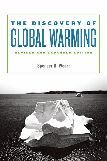
(Image by Harvard University Press)
My last recommendation will take longer for you to get through, but it is an invaluable resource. Physicist Spencer Weart offers a detailed but understandable account of the history of climate science research in his book The Discovery of Global Warming. You can read an extended version of book online on the American Institute of Physics’ website. If you make it all the way through, you will know far more than most people about the climate.
