
Remember the year 2000? Bill Clinton was president of the United States, Faith Hill and Santana topped Billboard music charts, and the world’s computers had just “survived” the Y2K bug. It also was the year that NASA’s Terra satellite began collecting images of Earth.
Eighteen years later, the versatile satellite — with five scientific sensors — is still operating. For all of that time, the satellite’s Moderate Resolution Imaging Spectroradiometer (MODIS) has been collecting daily data and imagery of the Arctic — and the rest of the planet, too.
If you knew where to look and were willing to wait patiently for file downloads, the images have always been available on specialized websites used by scientists. But there was no quick-and-easy way for the public to browse the imagery. With the recent addition of the full record of MODIS data into NASA’s Worldview browser, checking on what was happening anywhere in the world on any day since 2000 has gotten much easier.
Say you want to check on the weather in your hometown on the day you or your child was born. Just navigate to the date on Worldview, and make sure that the MODIS data layer is turned on. (In the image below, you can tell the Terra MODIS data layer is on because it is light gray.)
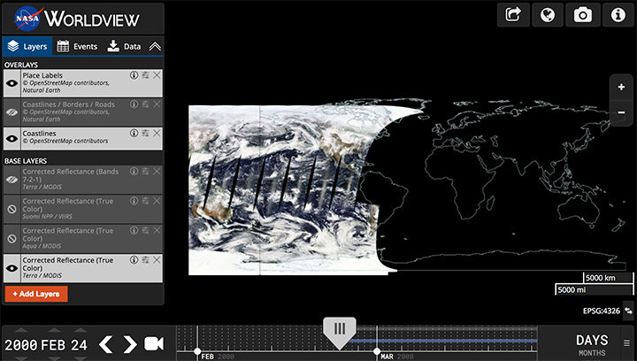
This Worldview screenshot shows the first day that Terra MODIS collected data — February 24, 2000. The very first Terra scene showed northern Argentina and Chile. Credit: EOSDIS.
One of the things I love about having all this MODIS data at my fingertips is that it makes it possible to see the passage of relatively long periods of time in just a few minutes. Look, for instance, at the animation at the top of this page, generated by Delft University of Technology ice scientist Stef Lhermitte using Worldview.
Lhermitte summoned every natural-color MODIS image of the Arctic that Terra and Aqua (which also has a MODIS instrument) have collected since April 2003. The result — a product of 71,000 satellite overpasses — is a remarkable six-minute time capsule of swirling clouds, bursts of wildfire smoke, the comings and goings of snow, and the ebb and flow of sea ice.
Though beautiful, Lhermitte’s animation also has a troubling side to it. If you look carefully, you can see the downward trend in sea ice extent. Look, for instance, at mid-August and September 2012 — the period when Arctic sea ice extent hit a record-low minimum of 3.4 million square miles. Between the heavy cloud cover, you will see lots of dark open water. Compare that to the same period in 2003, when the minimum extent was 6.2 million square miles. Scientists attribute the loss of sea ice to global warming.
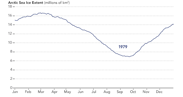
NASA Earth Observatory chart by Joshua Stevens, using data from the National Snow and Ice Data Center.
Earth Matters had a conversation with Lhermitte to find why he made the clip and what stands out about it. MODIS images of notable events that Lhermitte mentioned are interspersed throughout the interview. All of the images come from the archives of NASA Earth Observatory, a website that was founded in 1999 in conjunction with the launch of Terra.
What prompted you to create this animation?
The extension of the MODIS record back to the beginning of the mission in the Worldview website triggered me to make the animation. As a remote sensing scientist, I often use Worldview to put things into context (e.g. for studying changes over ice sheets and glaciers). Previously, Worldview only had data until 2010.
What do you think are the most interesting events or patterns visible in the clip?
I think the strength of the video is that it contains so many of them, and it allows you to see them all in one video. The ones that are most striking to me are:
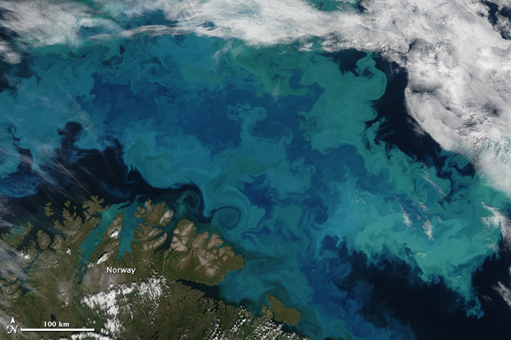
An Aqua MODIS image of a bloom in the Barents Sea on August 14, 2011. Image by Jeff Schmaltz, MODIS Rapid Response Team at NASA GSFC.
+ algal blooms in the Barents Sea
+ declining sea ice extent. You can see this both annually and over the longer term.
+ changing snow extent. You can see this each summer, especially over Canada and Siberia.
+ summer wildfire smoke in Canada (2004, 2005, 2009, 2014, 2017) and Russia (2006, 2011, 2012, 2013, 2014, 2016)
+ albedo reductions (reduction in brightness) over the Greenland Ice Sheet in 2010 and 2012 related to strong melt years.
+ overall eastward atmospheric circulation
+ the Grímsvötn ash plume (21 May 2011)
How did you make it? Was it difficult from a technical standpoint?
It was simple. I just downloaded the MODIS quicklook data from the Worldview archive using an automated script. Afterwards, I slightly modified the images for visualization purposes (e.g. overlaying country borders, clipping to a circular area). and stitched everything together in a video.
When you sit back and watch the whole video, how does it make you feel?
On the one hand, I am fascinated by the beauty and complexity of our planet. On the other hand, as a scientist, it makes me want to understand its processes even better. The video shows so many different processes at different scales, from natural processes (annual changes in snow cover and the Vatnajökull ash plume) to climate change related changes (e.g. the long term decrease in sea ice).
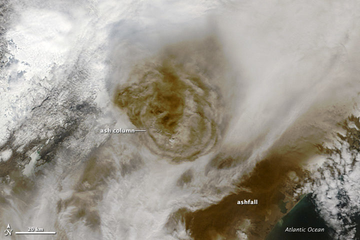
Terra MODIS image of the eruption of Grímsvötn Volcano in Iceland on May 22, 2011. NASA image by Jeff Schmaltz, MODIS Rapid Response Team.
There are some gaps during the winter where the extent of the sea ice abruptly changes. Can you explain why?
I used the standard reflectance products, which show the reflected sunlight. I decided to leave all dates out where part of the Arctic is without sunlight during satellite overpasses (approximately 10:30 a.m. and 1:30 p.m. local time). The missing data due to the polar night are very prominent if you compile the complete record including winter months, and I did not want it to distract the viewer from the more subtle changes in the video.
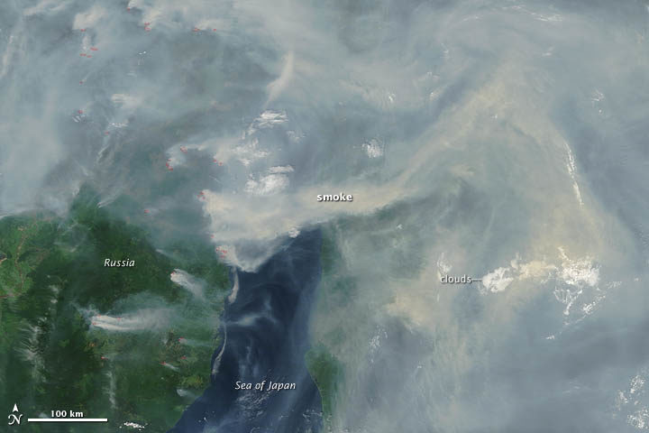
A Terra MODIS image of smoke and fires in Siberia on June 29, 2012. NASA image by Jeff Schmaltz, LANCE MODIS Rapid Response.
In the course of your day job as a scientist, do you use MODIS imagery? For what purpose?
Yes, as a polar remote sensing scientist, I tend to work with a range of satellite data sets. MODIS is a unique data product, given its global daily coverage and its long record. Besides the fact that I use MODIS frequently to monitor ice shelves and outlet glaciers, my colleagues and I use it to study snow and ice-albedo processes, snow cover in mountainous areas, vegetation recovery after wildfires, and ecosystem processes. One MODIS animation of ice calving from a glacier in Antarctica actually made it into the Washington Post recently.
Thank you, NASA. This animation of arctic sea ice will be very helpful for a presentation I am doing in May for the Canadian Pediatric Society on climate change and children’s health. I have enjoyed NASA Earth observatory for years. It’s VERY cool that we can make our own animations now. Thanks for making that easy. You’re the BEST!
When you can see the world over these scales and time spans, I am truly amazed. Please do not let short-sighted political pressure change your duty to inform others as to what is happening.