
Drew Skau and I have received a few comments on Subtleties of Color that deserve to be included. (By the way, don’t be shy. You can leave a comment here or at visual.ly)
Naomi B. Robbins demonstrated that the standard land cover classification palette fails for color-deficient viewers. She also pointed out that “color-deficient” is the correct term to use, not “color-blind”. (Robbins is an expert in graphical data presentation who leads her own consulting firm, NBR, tweets from @nbrgraphs, and has blogged for Forbes.)
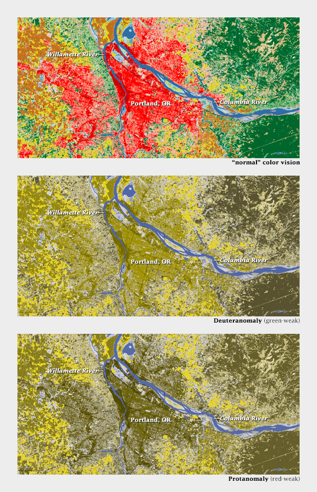
Color-deficient viewers would likely confuse red urban areas with green forests, not to mention tan scrub, in this land cover classification map of the Portland area.
Robbins is absolutely right, and I don’t think there’s an easy answer—even the Geological Survey, with its rich history of cartography, has problems displaying more than a handful of categories on a single map.
On an encouraging note, Mike Bostock sent examples (via Twitter: @mbostock) of CIE L*C*h color palettes dynamically generated by D3.js. In a web browser. (D3.js is a library that enables dynamic, interactive display of everything from time series to networks to maps. For those of us who began our careers 3 days before Netscape Navigator came out of beta, this is astonishing. Bostock created it.)
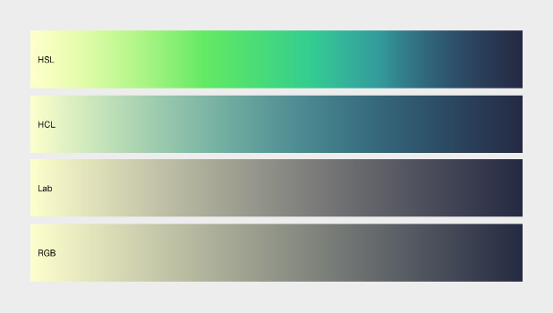
Comparison of color ramps generated with D3.js in hue, saturation, lightness (HSL, non-perceptual); hue, chroma, lightness (HCL, perceptual); L*a*b, (Lab, perceptual); and red, green, blue (RGB, non-perceptual). D3.js allows both the selection of start and end points and interpolation in perceptual color spaces.
Here’s an example of a palette applied to a grayscale image of topography by d3.js:
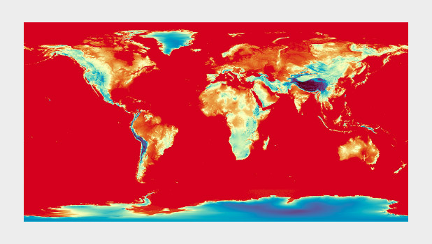
A divergent color map from D3.js (reminiscent of Color Brewer’s Spectral palette) used to display global topographic data. I do not usually recommend using a divergent palette to show sequential data, but this map cleverly uses the breakpoint (light yellow) to show median elevation. (It’s still a bit bright & saturated for my taste, though.)
I’ll post more comments if and when I get them.
Subtleties of Color
Part 1: Introduction
Part 2: The “Perfect” Palette
Part 3: Different Data, Different Colors
Part 4: Connecting Color to Meaning
Part 5: Tools & Techniques
Part 6: References and Resources for Visualization Professionals
This is a great read, I was not aware that color had so much to do with geography. Thanks for sharing
Jay Ali
Hello Ms.Naomi and Ms.Drew!
I probably am color deficient myself anyway.. 8)
Thank you for your most interesting article which triggered some thought / ideas as I was reading it..
Having seen the maps shown above, I desperately felt the need to ask you if a deformation set of pictures for a specific mountain is currently availablet to somehow indicate or even prove that part of Mount Kallidromo in Central Greece, where dozens of hot springs exist for centuries, now, after a “cloud” of approx 1,4oo pre-seismic incidents from just a little tremor 1,7R or even less to a remarkable 4,8R … epicenter positions cover the whole central portion of the mountain their position calculated mostly in deep fissures and faults. All these epicenter points are covering most of the central mountain part. The situation reminds me of the Mt.St.Helen’s Eruption and subsequent Pyroclastic Flow/ Landslide or Pinatubo Mud Volcano…(please correct me for any mistake about the latter volcano’s name )
Thanks in advance, looking forward to your answer.
Dimitris Trakadas, Architect NTUA, (amateur scientist in seismic and volcanic issues).
I find your series of articles about subtleties of color very inspiring, since it covers both technical and artistic aspects of adding color to data.
I just released an open-source script for Photoshop called Create Color Ramp which is used to create a 256-color ramp programmatically, using mathematical formulas expressed in one color model among: RGB, HSB, HSL. I would definitely like to get comments and suggestions to improve it so that it could be useful to cartographers too.
–Mikaeru