
Connecting Color to Meaning
Pretty much any dataset can be categorized as one of three types—sequential, divergent, and qualitative—each suited to a different color scheme. Sequential data is best displayed with a palette that varies uniformly in lightness and saturation, preferably with a simultaneous shift in hue. Divergent data is suited to bifurcated palettes with a neutral central color. Qualitative data benefits from a set of easily distinguishable colors. Palettes defined in a perceptual color space—particularly CIE L*C*h—will be more accurate than those composed using RGB or HSV color spaces, which are more suited to computers than people.
I consider those the fundamentals of color for data visualization. You’d better be certain you know what you’re doing before you violate those rules (i.e. don’t use a rainbow palette unless there’s a reason more compelling than “that’s how we’ve always done it”). What are the more subtle aspects of color for data visualization? The touches that (hopefully) put an image on the 10% side of Sturgeon’s Law (not the 90%).
Intuitive Colors
This may sound obvious, but it’s an underused principle. Whenever possible, make intuitive palettes. Some conventional color schemes, especially those used in scientific visualization, are difficult for non-experts to understand. In fact, one study found “satellite visualizations used by many scientists are not intelligible to novice users” (emphasis mine). Visualizations should be as easy as possible to interpret, so try to find a color scheme that matches the audience’s preconceptions and cultural associations.
It’s not always possible, of course (what color is electrical charge, or income?) but a fair number of datasets lend themselves to particular colors. Vegetation is green, barren ground is gray or beige. Water is blue. Clouds are white. Red, orange, and yellow are hot (or at least warm); blue is chilly.
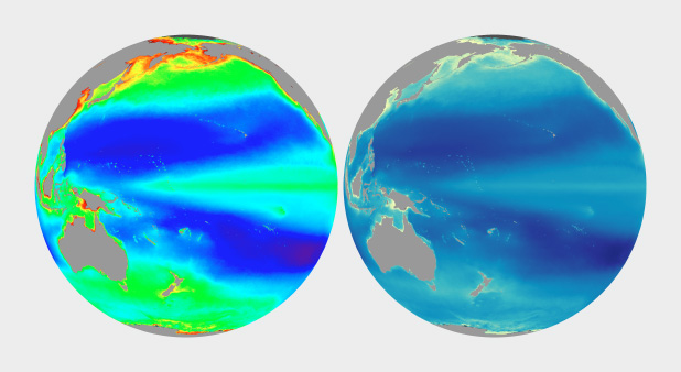
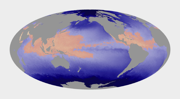
The unnatural colors of the rainbow palette (left) are often difficult for novice viewers to interpret. A more naturalistic palette for phytoplankton (more or less a type of ocean vegetation) trends from dark blue for barren ocean, through turquoise, green, and yellow for increasing concentrations of the tiny plants and algae.
In addition to colors affiliated with our physical environment (can you tell I primarily work on Earth science datasets?), cultural values are linked to certain colors. Check out the quilted thumbnails of Google image search results for words like “clean” (mint green) “malevolent” (ochre) and “abstract” (blue). Use these relationships to add cues into a visualization. Be aware that these are not universal, but vary by culture.
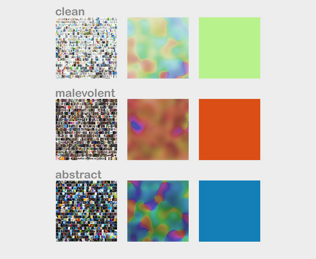
The cultural associations of color (at least in English), derived via Google image search. Image by John Nelson, IDV solutions.
Layering
The combination of two or more datasets often tell a story better than a single dataset, and the best visualizations tell stories. The color schemes for multiple datasets displayed together need to be designed together, and complement one another.
One approach is to layer datasets together, which is pretty much impossible if you’ve already used all the colors of the rainbow to display a single dataset. (I know I harp on the rainbow palette, and I’m sure you’re tired of it, but despite the well known flaws it’s still used in a disproportionate amount of visualization.) Instead, use muted colors to limit the range of hues and contrast in one dataset, and then overlay additional data, such as the contour lines and shaded relief of a topographic map combined with land cover, roads, and buildings.
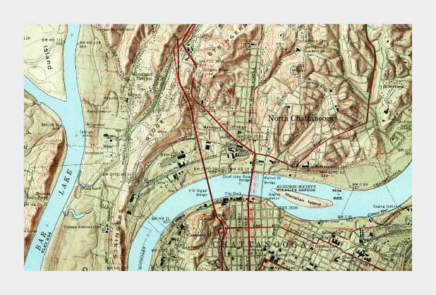
Muted colors, subtle shading and thin contour lines allow multiple types of data to be layered together in this 1958 topographic map of Chattanooga, Tennessee. (Did I mention cartographers have been doing this for ages, and are really good at it?)
Complementary Datasets
Other types of complementary data aren’t co-located: maps that include ocean and land, for example. In those cases careful control of lightness, saturation, and hue can enable quick differentiation as well as (mostly) accurate comparisons between datasets. Use two different hues, and vary the lightness and saturation simultaneously.
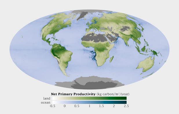
This map shows net primary productivity [a measure of the how much plants breathe (technically the amount of carbon plants take from the atmosphere and use to grow each year)] on land and in the ocean. The two datasets are qualitatively different (phytoplankton growing in the ocean, terrestrial plants on land), but quantitatively the same. The green land NPP is easily distinguishable from the blue oceans, but the relative lightness matches for a given rate of carbon uptake.
Non-diverging Breakpoints
Some sequential datasets feature one or more physically significant quantities: freezing on a map of temperature, for example. It’s not usually appropriate to use a full divergent palette, since the data are still on a continuum. To show these transitions, keep the change in lightness consistent throughout the palette, but introduce an abrupt shift in hue and/or saturation at the appropriate point. This does a good job of preserving patterns (again, one of the strengths of visualizations) while emphasizing and differentiating particular ranges of data.
Hurricanes and other tropical cyclones are able to form and strengthen in waters over 82˚ Fahrenheit. This ocean temperature map uses rose and yellow to distinguish the warm waters that can sustain tropical cyclones from cool water, colored blue. (Map based on Microwave OI SST Data from Remote Sensing Systems.)
Use Color to Separate Data from Non-Data
Since color attracts the eye, lack of color can cause areas of a graphic to recede into the background. This is an extremely useful tool for creating hierarchy in a visualization. After all, you want viewers to focus on what’s important. Areas of no data are almost always less important than valid data points, but it’s still essential to include them in a visualization. Simply choosing not to color areas of no data, but assigning them a shade of gray (or even pure black and white) simultaneously de-emphasizes missing data and separates it from data. Just be careful to choose a shade of gray that’s distinct from the adjacent data.
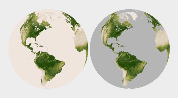
Missing or invalid data should be clearly separated from valid data. Simply replacing the light beige used to represent water in this map of land vegetation (left) with gray causes the land surfaces to stand out. (Vegetation maps adapted from the NOAA Environmental Visualization Laboratory.)
Figure-Ground
Sometimes it just comes down to a judgement call. I developed a special temperature map showing the hottest land temperatures over the course of a year, so the entire map had to feel “hot” but the merely warm areas were well over 40 degrees Celsius cooler than the hottest spots on Earth. Pale yellow to deep red felt like an obvious choice. It was reasonably intuitive, and the very hottest points stood out well from the lighter areas. The brain moves the bright red areas into the foreground, and pushes the pale yellows into the background.
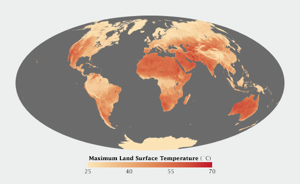
Warm colors, ranging from pale yellow to blood red, were most appropriate for this map of Earth’s hottest places.
When I applied the same color scale to a single day’s data, however, I was surprised to see that the coolest areas (irrigated fields) were subjectively hotter than their surroundings. The relatively small areas of pale yellow, surrounded by larger expanses of darker red, moved into the image foreground. (A combination of the compact areas of light color and very sharp boundaries, I think.) This subverted my intentions for the image. I ended up reverting to my standard blue-purple-red-yellow temperature palette, even though blue indicated temperatures of at least 30 degrees C (86 Fahrenheit)!
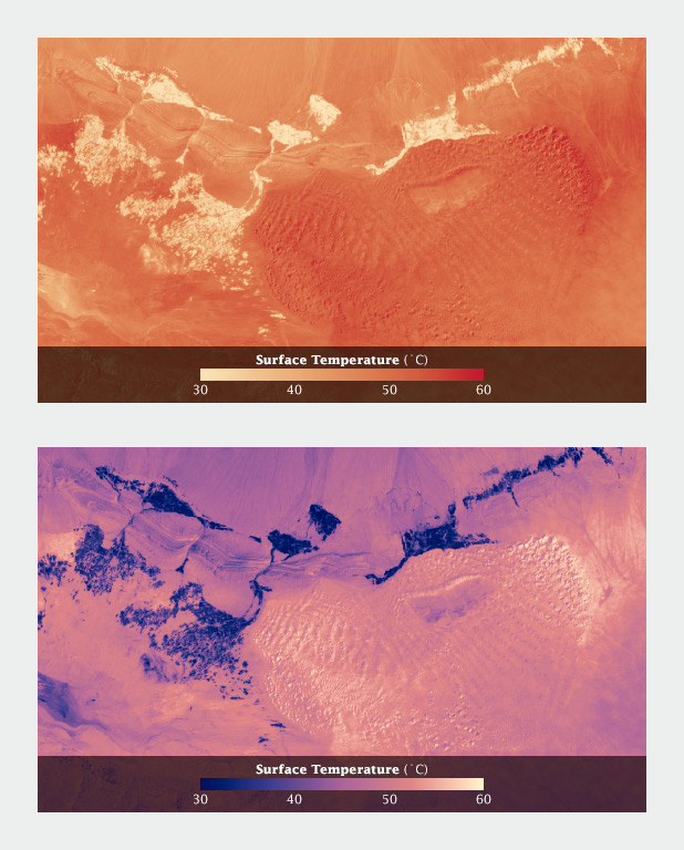
Using a yellow-red palette, cool irrigated fields appear warmer than the nearby dunes, inverting the true relationship. A palette that runs from blue through red to yellow reads more naturally.
Aesthetics
Aesthetics matter: attractive things work better.
Donald Norman, Emotional Design.
Most of these suggestions on the use of color are based on the principles of perception, which are derived from the neurological basis of how we see. They provide the foundation for accurate data visualization. But what separates “adequate” from “good” from “great” isn’t a matter of following rules—it’s a matter of aesthetics and judgement.
Follow good design practice as well as good visualization practice when developing imagery. In addition to color, consider the other aspects of design: typography, line, shape, alignment, etc. Be aware of the media you’re designing for. It may be trite, but a good visualization is better than the sum of its parts. Be aware of how the various elements of your design fit together. How do the colors used for the data interact with labels? With any nearby graphical elements? Are you designing for the web, television, or print? All of these considerations should inform your decisions.
Unfortunately I can’t provide any hard and fast rules to design visualizations that are aesthetically pleasing (or even beautiful). I can only encourage you to keep your eyes open. Look for good design, good art, and good visualization. Figure out why it works, and incorporate those elements into your own projects.
Subtleties of Color
Part 1: Introduction
Part 2: The “Perfect” Palette
Part 3: Different Data, Different Colors
Part 5: Tools & Techniques
Part 6: References & Resources for Visualization Professionals
(This series on the use of color in data visualization is being cross-posted on visual.ly. Thanks to Drew Skau at visual.ly for the invitation.)
Great guidelines, with careful attention to detail. Will aim to reproduce some of these palettes in Matlab – although I imagine somebody may have done this already.