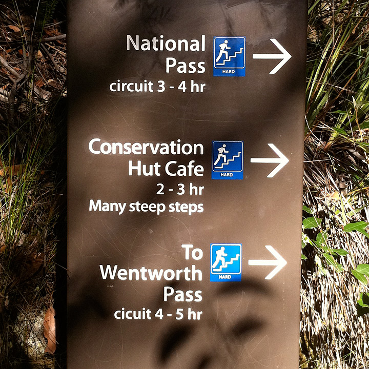
One of the best things about international travel (at least to a geek like me) is to see how different cultures approach design and signage. Here’s a few from Blue Mountains National Park, near Sydney, Australia.


One of the best things about international travel (at least to a geek like me) is to see how different cultures approach design and signage. Here’s a few from Blue Mountains National Park, near Sydney, Australia.

Directional signs are of great and continued use within national parks around the globe and well positioned do indeed save upon the use of maps, but here in England with open moorlands and lakes it would first be so unseemly to have these obtrusive signs at every bush and gateway and surely takeaway the beauty of knowing you were ‘outside’ rather than in a pre-determined area of ‘urban’ space where you can walk safely. Nature is just that.
Whilst I take Heidi’s point about saving the environment, without paper maps, destroying trees to create a map about a woodland that is now in the habds of the visitor, it is also part of the ‘nature’ culture to orientate your way through without too many signposts taking away the experience.