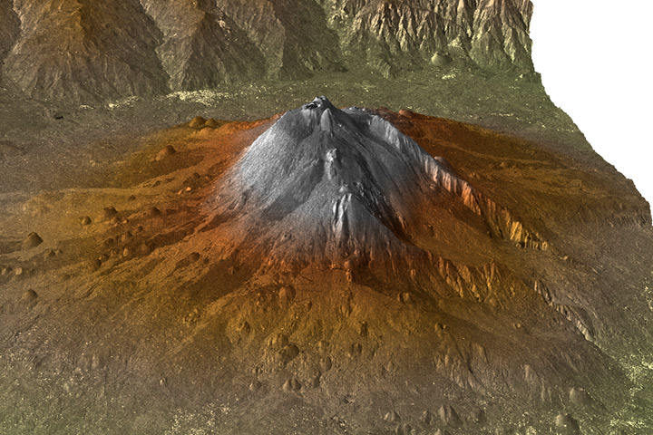
One of my (many) pet peeves in data visualization is vertical exaggeration. For example, here’s a 3D rendered view (from the south looking north) of Mount Etna:

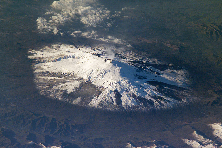
Compared to the real thing, photographed from the International Space Station (from the north looking south):

The 3D view is scaled so the volcano appears much higher than it does in real life—perhaps four or five times higher—but it’s impossible to tell since the caption doesn’t say. My big problem with this is that Etna looks like a classic, steep-sided stratovolcano (like Mount Fuji), rather than a complex mountain formed from a combination of viscous lavas (typical of stratovolcanoes), fluid lavas typical of shield volcanoes (like the Hawaiian Islands), and collapses (like Mount St. Helens).
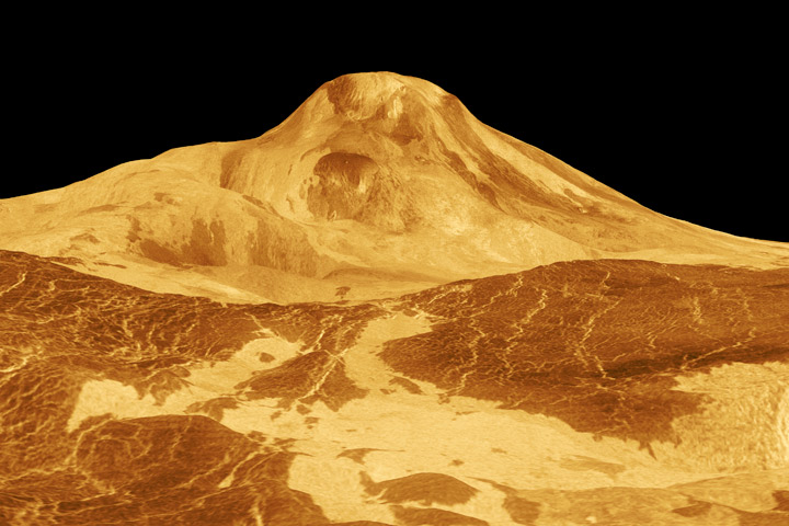
At least it’s not as bad as the infamous image of Maat Mons on Venus, which has a staggering vertical exaggeration of 22.5 times (Maat Mons is actually shaped more like a wad of gum on the sidewalk, not Mount Rainier):

Why does it matter? Because topography gives clues to the underlying geology and processes that form a landscape. For example, the angle of the walls of the Grand Canyon is determined by the rock type: hard rocks form cliffs, soft rocks form slopes. The vertical granite walls of Yosemite are composed of hard granite that resisted the erosion of ice age glaciers.
The reason for the shape of mountains on Venus is perhaps even more interesting. It’s so hot on the surface (465°C) that most of the rocks creep: over time solid materials deform under their own weight. This limits the height of mountains on Venus, and ensures that steep slopes—if they exist at all—are extremely rare (and likely indicative of active tectonics). The vertical exaggeration used in images of Venus’ surface obscures some of the fundamental processes that shaped the planet.
One final note: If you absolutely have to use vertical exaggeration, at least indicate that fact in the caption, or even better, include a scale on the image itself.
[Credit where credit is due: I first learned of Maat Mons from one of Edward Tufte’s lectures on data visualization. Tufte himself cited the “Flat-Venus Society” and NASA’s David Morrison.]
Tags: etna, topography, vertical exaggeration


Agreed! I expect what I’m seeing in a picture to be what I’d see ‘on the ground’, so anything else is confusing. That said, one of the places that vertical exaggeration has to be used is in geologic cross-sections, where differences on the order of 1 in 1,000 or less are significant.
Micheal:
Yup, this mostly applies to “photorealistsc” 3D renders—there are plenty of diagrams that benefit from exaggerated scaling. However, I think it’s important to keep in mind that this can lead to false impressions. One example is diagrams of subduction boundaries, which almost always show a steeply plunging subducting plate, when in reality the angle of descent is shallow.
Vertical exaggeration has a limited place, agreed.
One of the places where it is misleading is in one of those geological cross sections. Saw one in a geology text book showing a section across Yellowstone and it was obvious that the caldera rim was not as high in relation to the rest of the terrain as was shown.
Anyway, thank you again for the blog!
Excellent article, as always.
If you’re ever stuck for an idea to blog (although I don’t think that’s very likely), perhaps you could start a series called something like, “Top 10 worst visualization pet peeves”.
Formal education in GIS doesn’t dwell on the aesthetic and perceptual properties of mapping (at least it didn’t in my day), so I’m sure many readers would find a series like this to be very useful.