
Credit: NASA Earth Observatory/VIIRS/Jesse Allen. More details about the image here.
In the past two months, weather reports in California, Oregon, and Washington have been filled with news of “atmospheric rivers” bringing copious amounts of rain and snow to the western United States. Atmospheric rivers are long, thin fingers of moisture that develop in the tropics and flow into higher latitudes. If one of them makes landfall, huge of amounts of rain and snow can fall in a short period.
Much of this moisture, of course, eventually finds its way back to the sea through rivers. When waterways are swollen and flowing rapidly, they also become rivers of suspended sediment, full of clay, mud, sand, and other debris. Though the flooding from atmospheric river events can be devastating, the enormous amount of sediment they send rushing into the sea can also be surprisingly beautiful.
For instance, on February 11, 2017, the Visible Infrared Imaging Radiometer Suite (VIIRS) on Suomi NPP acquired this remarkable view of rivers and streams spewing sediment into the Pacific Ocean. Close to the outlets of streams and rivers, sediment-rich waters appear brown. As the sediment dissipates and mixes into the ocean, the water appears teal.
Duane Waliser, a scientist at NASA’s Jet Propulsion Laboratory, recently tallied just how damaging atmospheric rivers can be for coastal areas. In a study published in Nature Geoscience, Waliser and a colleague showed that atmospheric rivers are among the most damaging storm types in the middle latitudes. Of the very wettest and windiest storms (those ranked in the top 2 percent), atmospheric rivers were associated with nearly half of them. Waliser and colleagues also found that atmospheric rivers were associated with a doubling of the typical wind speed compared to all storm conditions.

Image originally published by NOAA.

Image Credit: NASA Earth Observatory/Joshua Stevens
In celebration of Valentine’s Day, the NASA Earth Observatory staff took some time to look through our archives to find a few images that we absolutely love. You will find eight of our favorite scenes below: the islands of Mergui Archipelago, tea-colored water in James Bay, a snowy scene of Long Island, the intricate waterways of Musa Bay, an eddy of phytoplankton near South Africa, the Nardo racing ring in Italy, sea ice and icebergs in Antarctica, and a meandering river in the Amazon. Each staff member wrote a short note explaining why they chose the image.
Do you have a crush on NASA, earth science, and satellite imagery like we do? Get in on the fun by finding your favorite image from our archives and posting the link to the comment thread (and your social media sites of choice) with a few words explaining why you love the image. If you have trouble finding the perfect match by blindly searching our archives, you can also go to this page and sort by category, year, and month. You can also try our Visible Earth archive, where the images are conveniently categorized by what they show and which satellite sensor acquired them.

Image credit: NASA Earth Observatory/Landsat 5/TM. More details here.
This image is full of fantastic reminders about our planet and the science of Earth observation. Sediment flows, forests, and human settlement can all be seen in gorgeous color. But what’s more — the image was acquired by Landsat 5 back in 2004. We are currently two generations further in the Landsat constellation; this image is a vivid reminder of the quality and depth of that legacy. — Joshua Stevens, data visualizer

Image credit: NASA Earth Observatory/Landsat 8/OLI. More details here.
If you’ve ever read the blog FYFD or even spent time looking carefully at cream swirling around in your coffee, you’ll know why I love this image. There are times that fluids just going about their mundane business of mixing and flowing make patterns that are insanely beautiful. Check out our original story for a more detailed view of the von Kármán vortices swirling away from the small island in the middle of the Bay to see what I mean. — Adam Voiland, science writer

Image credit: NASA Earth Observatory/Landsat 8/OLI. More info here.
Home is where the heart lies. In my case, that’s New York City and Long Island — my two homes. I grew up in both of these places, and love them both. This image shows dense snow that covered New York in February 2015. If Landsat 8’s Operational Land Imager (OLI) could zoom in farther, you might see my mom and me cross-country skiing on the beach, or my dog bounding through the hills of snow. I still remember the enormous ice floes in Long Island Sound, which you can see in this image. — Pola Lem, science writer

Image Credit: NASA Earth Observtory/EO-1/ALI. More info here.
There’s a lot to this image I really like. The dendritic pattern of waterways and the sharp contrast that has against the strong straight linear features of man-made structures is quite striking. Also, the way that the warm, reddish-browns and the cool-toned blues and greens weave together is really compelling. Finally, I like the backstory of how we found this image: it was an accidental discovery made possible only because the satellite — Earth Observing-1 — produces a small number of images each day, making reading the entire list of images acquired (not just known objects of interest) possible for serendipitous discoveries like this. — Jesse Allen, data visualizer

Image credit: NASA Earth Observatory/Terra/MODIS. More info here.
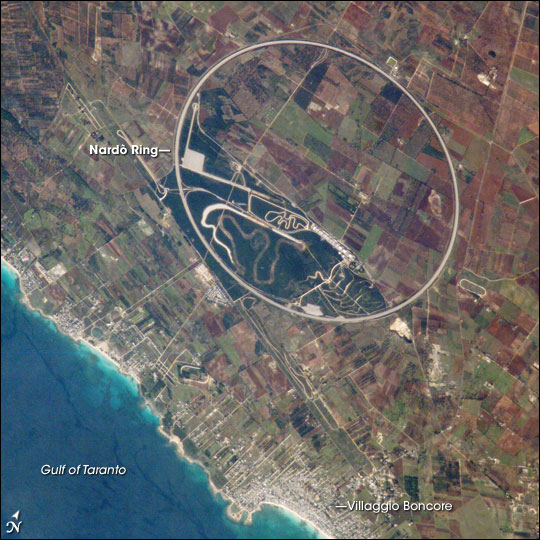
Image credit: NASA/International Space Station/Expedition 14. More info here.
Being an automotive enthusiast, as well as an amateur racer, I’ve always loved images of the Nardo Ring. This racing circuit is a perfect circle, and massive in order to be used for vehicle testing. Highways, city girds, and other roadways are often prominent features in astronaut photography, but the scale and precision of the Nardo Ring are impressive when set against the Italian farm fields. It’s easy to see, even from up there, the impact the racing and automotive culture has on Italy, and the rest of the world. — Paul Przyborski, programmer/dba/designer

Image credit: NASA Earth Observatory/EO-1/ALI. More info here.
I really like this image because of the variety of blue and white hues. There is young ice, old ice, icebergs that are trapped in sea ice, and all of it is accentuated by an oblique sun angle casting shadows and highlighting texture. — Kevin Ward, team leader

Image Credit: NASA Earth Observatory/Landsat 8/OLI. More info here.
If I’m not mountain biking, you will probably find me kayaking—a hobby partly inspired by regularly seeing incredible views of Earth’s rivers from space at work. What I love most about this image of Rio Mamoré in the Amazon Basin is how you can see how much the rivers meander and migrate over time. Interestingly, researchers studying rivers in this region found that the greater the amount of sediment from external sources (glacial, volcanic, or human activity), the more likely the rivers were to meander. — Kathryn Hansen, science writer

NASA Earth Observatory images by Joshua Stevens, using VIIRS data from the Suomi National Polar-orbiting Partnership and the Fire Information for Resource Management System (FIRMS). The map shows fires detected on November 2, 2016.
When I was writing about the crop fires in northern India last fall, it was obvious that 2016 was a pretty severe burning season. For several weeks, large plumes of smoke from Punjab and Haryana blotted out towns and cities along the Indo-Gangetic plain in satellite images.
But I didn’t realize just how severe the fires were until Hiren Jethva, an atmospheric scientist at NASA Goddard Space Flight Center, crunched the numbers. By analyzing satellite records of fire activity, he found that the 2016 fires were the most severe the region has seen since 2002 in regards to the number of fire hot spots satellites detected. In regards to the amount of smoke detected, the 2016 burning was the most severe observed since 2004. He used data from the Moderate Resolution Imaging Spectroradiometer (MODIS) sensor on Aqua and the Ozone Monitoring Instrument (OMI) on Aura to reach his conclusions.
Smoke and fire in northern India have become common in October and November during the last three decades because farmers increasingly use combines to harvest rice and wheat. Since these machines leave stems and other plant residue behind, farmers have started to use fire to clear the leftover debris away in preparation for the next planting.
For more details about how 2016 compared to past years, see the charts below, which Jethva prepared. His explanation for each chart is in italics.
Aqua Detected More Fires in 2016 Than During Any Year Since 2002

Chart by Hiren Jethva based on MODIS data.
The satellite-based sensor MODIS can detect the signal of fire hot spots, also called thermal anomalies, because the signal measured by the sensor in space in the thermal infrared bands appears to be an anomaly compared to the signal emanated from the background land. Since its launch in 2002, the MODIS on NASA’s Aqua satellite has detected thermal anomalies such as wildfires, agricultural fires, and gas flares on a daily basis.
The yearly evolution of total number of fires and Fire Radiative Power (FRP) — the heat energy produced from these fires — detected over Punjab and Haryana showed 2016 to be an anomalous year, with the highest number of crop residue fires (18,707) and the highest FRP in relation to the fires in all other years over the region. In comparison to 2015, the total number of fire hot spots detected over the region in 2016 was 43 percent higher; the difference is 25 percent if the hot spot counts are averaged over the last five years, i.e., 2011-2015. A careful look at the time-evolution of fire counts also reveals an increasing trend in the total number of fires over the region.
Punjab Skies Were Unusually Smoky

Chart by Hiren Jethva based on OMI data.
These fires produced huge amounts of fine aerosol particles and trace gases, which can potentially impact the climate and degrade air quality drastically at ground level. NASA’s A-train sensors such as the Ozone Monitoring Instrument (OMI) on the Aura satellite and the MODIS on Aqua offer capabilities to measure the total amounts of airborne particles. The UV Aerosol Index (UV-AI), which is an excellent indicator of the column amounts of light-absorbing particles in clear as well as cloudy atmospheres, showed 2016 was the smokiest season on record since 2004.
Greener Fields and Larger Harvests Lead to More Fires

Many studies have shown that satellite measurements of the “greenness” of crop fields prior to harvest and crop yield after the harvest are strongly correlated. The normalized difference vegetation index (NDVI), which is derived from satellite measurements of radiation at the red and near-infrared light, is one useful measure of greenness. As seen in the charts above, there seems to be a one-to-one relationship in NDVI measured by the MODIS sensor on Aqua prior to harvest (September) and the total number of fire hot spots observed during harvest season (Oct-Nov). This suggest that the increase in the number of fires is likely related to increasing crop yields.

Every month on Earth Matters, we offer a puzzling satellite image. The February 2017 puzzler is above. Your challenge is to use the comments section to tell us what part of the world we are looking at, when the image was acquired, what the image shows, and why the scene is interesting.
How to answer. Your answer can be a few words or several paragraphs. (Try to keep it shorter than 200 words). You might simply tell us what part of the world an image shows. Or you can dig deeper and explain what satellite and instrument produced the image, what spectral bands were used to create it, or what is compelling about some obscure speck in the far corner of an image. If you think something is interesting or noteworthy, tell us about it.
The prize. We can’t offer prize money or a trip to Mars, but we can promise you credit and glory. Well, maybe just credit. Roughly one week after a puzzler image appears on this blog, we will post an annotated and captioned version as our Image of the Day. After we post the answer, we will acknowledge the person who was first to correctly ID the image at the bottom of this blog post. We may also recognize certain readers who offer the most interesting tidbits of information about the geological, meteorological, or human processes that have played a role in molding the landscape. Please include your preferred name or alias with your comment. If you work for or attend an institution that you want us to recognize, please mention that as well.
Recent winners. If you’ve won the puzzler in the last few months or work in geospatial imaging, please sit on your hands for at least a day to give others a chance to play.
Releasing Comments. Savvy readers have solved some of our puzzlers after only a few minutes or hours. To give more people a chance to play, we may wait between 24-48 hours before posting the answers we receive in the comment thread.
Good luck!
Editor’s Note: Congratulations to Gareth Renowden for being the first reader to solve the puzzler on the Earth Observatory site, and to Mark Baumgartner for answering first on Facebook. See a labeled version of the February puzzler here.

Image courtesy of AVO/USGS.
Looking at Earth from space every day, we notice that nature takes on some curious shapes. (We have found, for example, features that resemble every letter of the alphabet.) The landform in the image above, which looks a lot like a human ear, is actually Bogoslof Island—a volcano in the Bering Sea that has been erupting in recent weeks. But the island didn’t always have an ear-like shape, and it might not look that way in the future.
Bogoslof has been erupting since mid-December 2016. We wrote about it a few weeks ago when satellite imagery showed a plume of steam and ash ejected from the volcano’s vent. Much of the volcano was (and remains) under water, with only a small part of the volcano’s top rising above the surface. Interaction of the vent with seawater was the reason that the plume contained so much steam. But by the end of January 2017, things had changed. The image above, from the Alaska Volcano Observatory (AVO), shows the island’s new shape after an eruption on January 30-31.
The image was described in more detail by Dave Schneider on the AVO website:
“Freshly erupted volcanic rock and ash have formed a barrier that separates the vent from the sea. This is the first time this has been observed since the eruptive sequence began in mid-December 2016. The vent is below sea level, and erosion of the ash deposits by wave or eruptive processes would allow sea water to flow into the vent again.”
Find more information and images describing Bogoslof and its changing form here.
