

If you follow Earth and climate science closely, you may have noticed that the media is abuzz every December and January with stories about how the past year ranked in terms of global temperatures. Was this the hottest year on record? In fact, it was. The Japanese Meteorological Agency released data on January 5, 2015, that showed 2014 was the warmest year on its record. NASA and NOAA made a similar announcement on January 16. The UK Met Office, which maintains the fourth major global temperature record, ranked 2014 as tied with 2010 for being the hottest year on record on January 26.
Astute readers then ask a deeper question: why do different institutions come up with slightly different numbers for the same planet? Although all four science institutions have strong similarities in how they track and analyze temperatures, there are subtle differences. As shown in the chart above, the NASA record tends to run slightly higher than the Japanese record, while the Met Office and NOAA records are usually in the middle.
There are good reasons for these differences, small as they are. Getting an accurate measurement of air temperature across the entire planet is not simple. Ideally, scientists would like to have thousands of standardized weather stations spaced evenly all around Earth’s surface. The trouble is that while there are plenty of weather stations on land, there are some pretty big gaps over the oceans, the polar regions, and even parts of Africa and South America.
The four research groups mentioned above deal with those gaps in slightly different ways. The Japanese group leaves areas without plenty of temperature stations out of their analysis, so its analysis covers about 85 percent of the globe. The Met Office makes similar choices, meaning its record covers about 86 percent of Earth’s surface. NOAA takes a different approach to the gaps, using nearby stations to interpolate temperatures in some areas that lack stations, giving the NOAA analysis 93 percent coverage of the globe. The group at NASA interpolates even more aggressively—areas with gaps are interpolated from the nearest station up to 1,200 kilometers away—and offers 99 percent coverage.
See the chart below to get a sense of where the gaps are in the various records. Areas not included in the analysis are shown in gray. JMA is Japan Meteorological Agency data, GISTEMP is the NASA Goddard Institute for Space Studies data, HadCrut4 is the Met Office data, UAH is a satellite-based record maintained by the University of Alabama Huntsville (more on that below), NCDC is the NOAA data, and NCEP/NCAR is a reanalysis of weather model data from the National Center for Atmospheric Research.
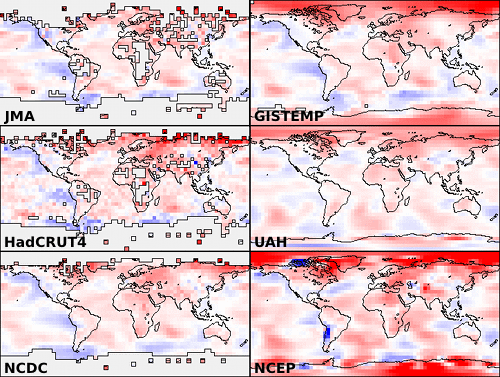
Chart from Skeptical Science.
If you’re a real data hound, you may have heard about other institutions that maintain global temperature records. In the last few years, a group at UC Berkeley — a group that was initially skeptical of the findings of the other groups — developed yet another approach that involved using data from even more temperature stations (37,000 stations as opposed to the 5,000-7,000 used by the other groups). For 2014, the Berkeley group came to the same conclusion: the past year was the warmest year on record, though their analysis has 2014 in a virtual tie with 2005 and 2010.
Rather than coming up with a way to fill the gaps, a few other groups have tried using a completely different approach. A group from the University of Alabama-Huntsville maintains a record of temperatures based on microwave sounders on satellites. The satellite-based record dates back 36 years, and the University of Alabama group has ranked 2014 as the third warmest on that record, though only by a very small margin. Another research group from Remote Sensing Systems maintains a similar record based on microwave sounders on satellites, although there are a few differences in the way the Remote Sensing Systems and University of Alabama teams handle gaps in the record and correct for differences between sensors. Remote Sensing Systems has 2014 as the 6th warmest on its record.
But let’s get back to the original question: why are there so many temperature records? One of the hallmarks of good science is that observations should be independently confirmed by separate research groups using separate methods when possible. And in the case of global temperatures, that’s exactly what is happening. Despite some differences in the year-to-year rankings, the trends observed by all the groups are roughly the same. They all show warming. They all find the most recent decade to be warmer than previous decades.
You may observe some hand-wringing and contrarian arguments about how one group’s ranking is slightly different than another and about how scientists cannot agree on the “hottest year” or the temperature trend. Before you get caught up in that, know this: the difference between the hottest and the second hottest or the 10th hottest and 11th hottest year on any of these records is vanishingly small. The more carefully you look at graph at the top of this page, the more you’ll start to appreciate that the individual ranking of a given year hardly even matters. It’s the longer term trends that matter. And, as you can see in that chart, all of the records are in remarkably good agreement.
That said, if you are still interested in the minutia of how these these data sets are compiled and analyzed, as well as how they compare to one other, wade through the links below. Some of the sites will even explain how you can access the data and calculate the trends yourself.
+ UCAR’s Global Temperature Data Sets Overview and Comparison page.
+ NASA GISS’s GISTEMP and FAQ page.
+ NOAA’s Global Temperature Analysis page.
+ Met Office’s Hadley Center Temperature page.
+ Japan Meteorological Agency’s Global Average Surface Temperature Anomalies page.
+ University of Alabama Huntsville Temperature page.
+Remote Sensing Systems Climate Analysis, Upper Air Temperature, and The Recent Slowing in the Rise of Global Temperatures pages.
+ Berkley Earth’s Data Overview page.
+ Moyhu’s list of climate data portals.
+ Skeptical Science’s Comparing All the Temperature Records, The Japan Meteorological Agency Temperature Records, Satellite Measurements of the Warming in the Troposphere, GISTEMP: Cool or Uncool, and Temperature Trend Calculator posts.
+ Tamino’s comparing Temperature Data Sets post.
+NOAA/NASA 2014 Warmest Year on Record powerpoint.
+James Hansen’s Global Temperature in 2014 and 2015 update posted on his Columbia University page.
+The Carbon Brief’s How Do Scientists Measure Global Temperature?
+Yale’s A Deeper Look: 2014’s Warming Record and the Continued Trend Upwards post.
Oh boy! 99 percent coverage, much of which is “estimated” (interpolated) by believers and thus unrepresentative.
Glad you had the courage to note the miniscule temperature differences. The amount of the temperature claimed to make last year the warmest ever experienced by mammals is way, way, way, smaller than the margin of error of the ability to measure temperature. Hello!?!
So, stop the nonsense that man-made global warming is “the” reason for any (wishful) measured warming.
I recommend actually reading the article instead of looking for bits to support your biases.
r medred, I disagree with what you wrote “99 percent coverage, much of which is “estimated” (Interpolated)”. If the data set with no interpolation, JMA, has 85% covered, then the NASA data is only 14% interpolated.
I’d say the opposite “99% coverage, MUCH of which is measured”
Interpolation uses the neighboring measurements and applies the weather trends to estimate the temperature in uncovered areas.
Did you look at the graph? Sometimes the JMA data is the highest and sometimes it is the lowest.
I believe you misunderstood what they meant by what you called “miniscule temperature differences”. They were talking about the differences between the measurement systems within a given year. Also, when comparing which year was hottest, 2014, 2010, 2005
Hello? did you look at the graph, note that all the organization’s data shows the same OVERALL TREND. Compare 2014 to 2000 to 1990 to 1970… All the data shows a SIGNIFICANT increase!
How a land and sea surface temperatures are measured by satellites?
Prasad, you can search the internet for something like “microwave sounders on satellites measure temperature”. I found many articles and papers on this technology. For example:
http://en.wikipedia.org/wiki/Satellite_temperature_measurements
While today’s temperature measurement are becoming more and more accurate, I always wonder how accurate temperature measurements were 50 to 100 years ago. My question is “How reliable, accurate were these global measurements”? There were many more measurement “gaps” back then back hence plenty of room for error yet these data are treated as scientifically accurate as today’s data. How can climatologists use these data for comparison when they may be inaccurate?
Put this into the global picture:
Let’s say in one century the average temperature of the earth has increased 1 degree. How much energy does it correspond? Compare this value to the energy needed to support the ice loss on the pols and in the permafrost during the same period. I guess the second value is way bigger than the first.
The trend of this temperature increase show much less than the real global warming is. I wouldn’t even call our age as “global warming” rather “global melting”. The drastic increase in global temperature starts in centuries when there would be no ice to be melt any more to counteract energy inbalance of 0.5 W/m2 of the Earth.
Thanks for the piece but it does show the entire global temp picture is built on sand. At circa 150 million sq kms the surface of the earth is non homogenous and temp trends produced from about 20k points to accuracies of tenths and hundredths of a degree borders on ludicrous. These points lie in predominantly urban areas and deriving global policy on such poor data is like deciding to switch the heating on or off in an old persons residential home based on temp records from just the kitchen during cooking.
Root and branch methodolgy review required in matters climate.
Love to know just how accurate the ability to take global temp was 100 years ago. Not at all I guess. People didnt worry about such things No one travelled and if they did it was on a ship etc. They were not worried about accurate temp taking at all 100 years ago even if the machines to take it were accurate and I doubt that.
i think this global warming is a lot of hype made by scientists keeping themselves in a good job. The real problem is the fact oil will run out and there is no alternative So what does the human race do then as we depend on it for everything.