 | |||
Frigid, battered by hurricane-force winds, dark half of the year, and littered with steep mountains and deep crevasses that could swallow you whole, Antarctica isn’t a place you want to visit without a map. What’s more, you would want that map to be as detailed and up-to-date as possible. Of course, hostile conditions make thorough on-the-ground mapping dangerous, if not impossible. But thanks to NASA satellite data, scientists visiting or studying Antarctica after October 2005 will have a significantly better map of the continent’s surface than they have had before. |
by Michon Scott | 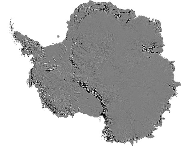 |
|
Using data from the Moderate Resolution Imaging Spectroradiometer flying on NASA’s Terra and Aqua satellites, researchers at the National Snow and Ice Data Center (NSIDC) at the University of Colorado and the University of New Hampshire have assembled the most detailed map of Antarctica’s snowy surface yet produced. Called the Mosaic of Antarctica (MOA), this map shows the continent with unprecedented detail. “It’s an almost perfect picture of the surface of the continent,” says Ted Scambos, lead scientist at NSIDC. The MOA map includes all land areas south of 60 degrees South that are bigger than a few hundred meters—in other words, all areas covered by the Antarctic Treaty. |
The Mosaic of Antarctica covers all land areas south of 60 degrees South larger than a few hundred meters. This includes all areas covered by the Antarctic Treaty. (Image courtesy National Snow and Ice Data Center based on MODIS data) | ||
 | |||
To assemble MOA, Scambos and his collaborators collected 260 MODIS images of Antarctica acquired between November 20, 2003, and February 29, 2004. They selected each image so that the angle of sunlight in the final map would be the same for all images, giving all of them the same shadows and contrast. They checked each image for anything that would obscure the view of the land surface—blemishes or noise in the data, glare from the Sun, clouds, cloud shadows, fog, and blowing snow. “We cut those areas out, and the resulting images looked sort of like Swiss cheese,” Scambos explains. Next, they “stacked the pieces of Swiss cheese” to cover the continent. By stacking the images, the MOA team accomplished two things. First, the team managed to fill in all the holes left by the image-cleaning process so that no land surface was missing. Second, stacking the images increased the resolution (amount of detail) beyond what any single image contained. |
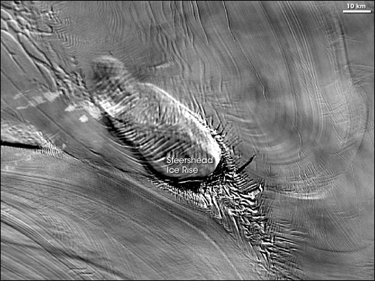
Although they also take pictures from above, satellites provide a completely different perspective than aerial flights. This satellite image, which looks vaguely like a giant trilobite, shows a feature in Antarctica known as the Steershead Ice Rise. The feature actually got its name due to the ice features at the base of the ice rise. Navy pilots flying from McMurdo Station to Byrd Station in Antarctica saw a foreshortened view of the crevasses to the lower right of the ice rise and thought they looked like the head of a steer. (Image courtesy National Snow and Ice Data Center based on MODIS data) | ||
“Adding pictures is a bit like focusing. We can use the information in a lot of images to make a final picture that’s a little bit better than any single image,” explains Scambos. “We stacked at least four images to make every part of the mosaic. On average, we stacked 15 images. In one area, 38 images overlapped.” |
| ||
To make MOA, the researchers started with MODIS’ 250-meter-per-pixel resolution data, but the resulting image has even higher resolution. “It doesn’t make sense to stray too far from the resolution of the satellite data,” Scambos says. “But to show all the features in the new image, you must use a finer scale.” MOA’s estimated resolution is 150 meters per pixel. |
| ||
 | |||
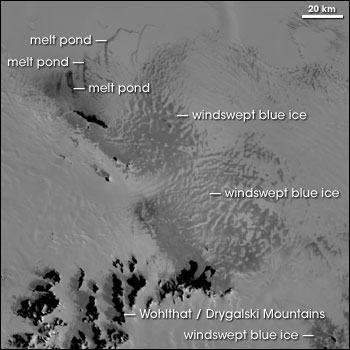
The MOA imagery has a grayscale color scheme, but in a land of snow and ice, color isn’t as crucial as it would be in forested or farmed land. Some patches of color do appear on the ice, however. For example, over time, windswept snow can eventually transform into pure ice composed of big crystals. On the ground, this thick, clear ice appears blue. To identify colored features like blue ice, scientists can make pseudo-color images by combining the grayscale MOA images with MODIS data from different parts of the light spectrum, including red and infrared light. Detailed as it is, MOA is not intended to work in isolation; scientists designed it to integrate well with other images. For example, NASA and the Byrd Polar Research Center previously published an image of Antarctica based on radar data from the Radarsat Antarctic Mapping Project Antarctic Mapping Mission 1 (RAMP AMM-1). “In fact, we used RAMP data as a reference when we built MOA,” says Scambos. “RAMP is great for looking at subsurface features. MOA focuses on the surface. So depending on what you’re looking for, you can use either mosaic alone, or combine them [MOA and RAMP maps] for a more complete picture.” |
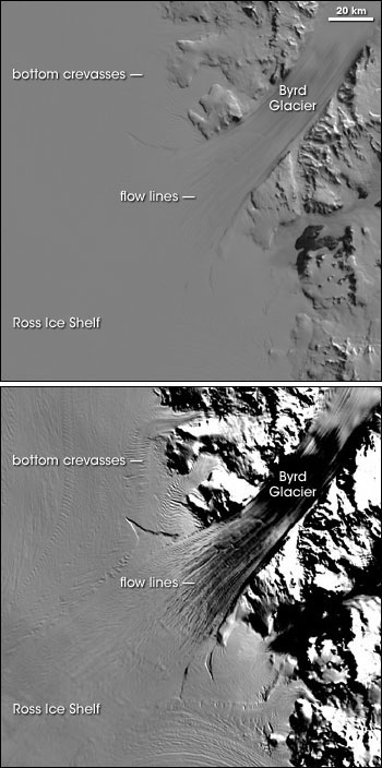
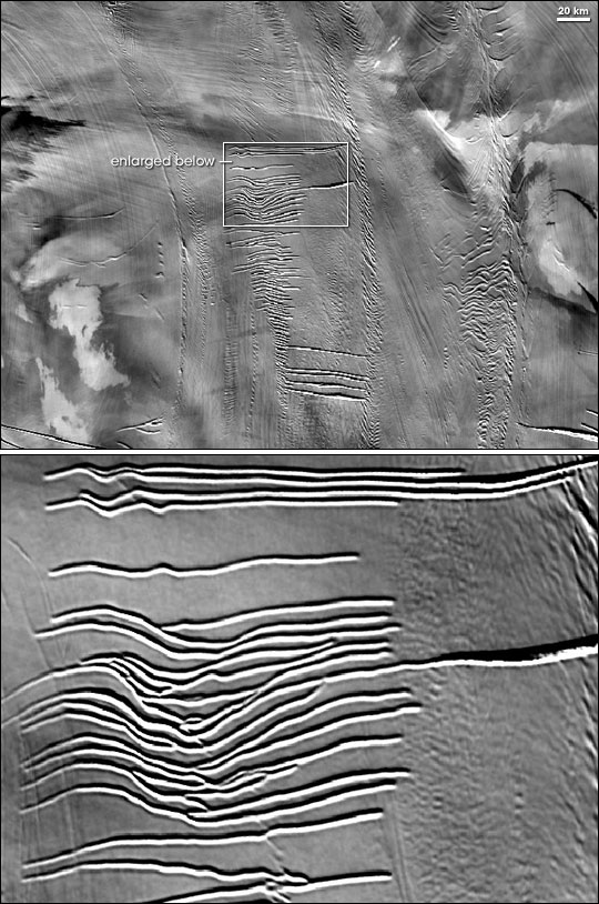
NSIDC’s MOA map server also lets users choose the magnification level for any image. These images show ice dynamics on the Ross Ice Shelf; the bottom image is magnified several levels beyond the top image. Such zoom capabilities enable researchers to form a better picture of safety hazards like crevasses, and flow lines that illuminate the process of ice movement. (Images courtesy National Snow and Ice Data Center based on MODIS data) | ||
 | |||
Anyone interested in using MOA data can download the imagery easily by using the MOA map server on the National Snow and Ice Data Center’s Website. The map server lets users select the precise area of interest and display it at whatever magnification they desire. The map server also lets users choose the desired level of contrast, which changes which surface features are most obvious in a scene. “MOA exploits the capability of MODIS to give the best picture,” says Scambos. “It reveals a lot of surface detail, and it covers a huge area. This is a big step in mapping Antarctica.”
|
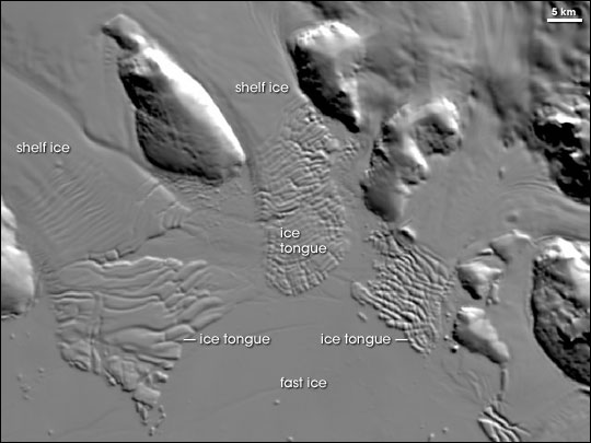
This MOA image shows part of the Sulzberger Ice Shelf. MOA’s enhanced contrast capabilities show shelf ice as it breaks into ice tongues. “Fast ice” is a kind of sea ice. It gets its name not because its movement is fast, but because it’s held fast to the shore or sea floor and doesn’t move with winds or currents. (Image courtesy National Snow and Ice Data Center based on MODIS data) | ||
