
Contributing to millions of premature deaths each year, air pollution is one of the world’s greatest environmental health risks. According to the World Health Organization, about seven million people died prematurely in 2012 because of exposure to air pollution (both indoor and outdoor) over the course of their lifetimes. That’s about one out of every eight deaths.
So how does exposure to air pollution vary around the world and how has it changed over time? Since many countries lack robust networks of ground-based air pollution sensors, this has been a difficult question for atmospheric scientists to address. But in recent years, satellites have started making uniform observations of air pollution on a global scale. When combined with increasingly-sophisticated computer models, the data have started to provide some answers.
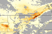
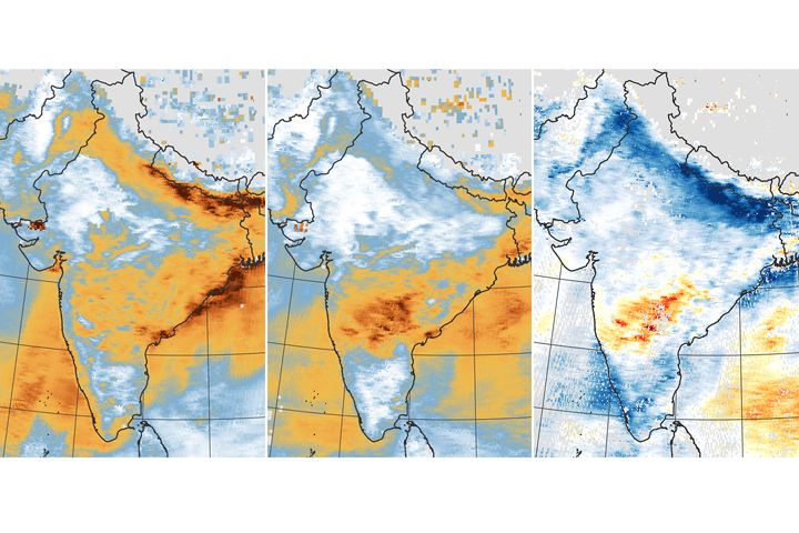
One important type of pollution is particulate matter, a complex mixture of airborne solid and liquid particles. While satellites do not directly measure particulate matter near Earth’s surface, they can provide information about the overall abundance of aerosols, a general term for airborne particles that includes particulates. For instance, a number of satellites make observations of aerosol optical depth (AOD), a measure of how aerosols absorb and scatter light.
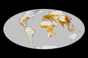
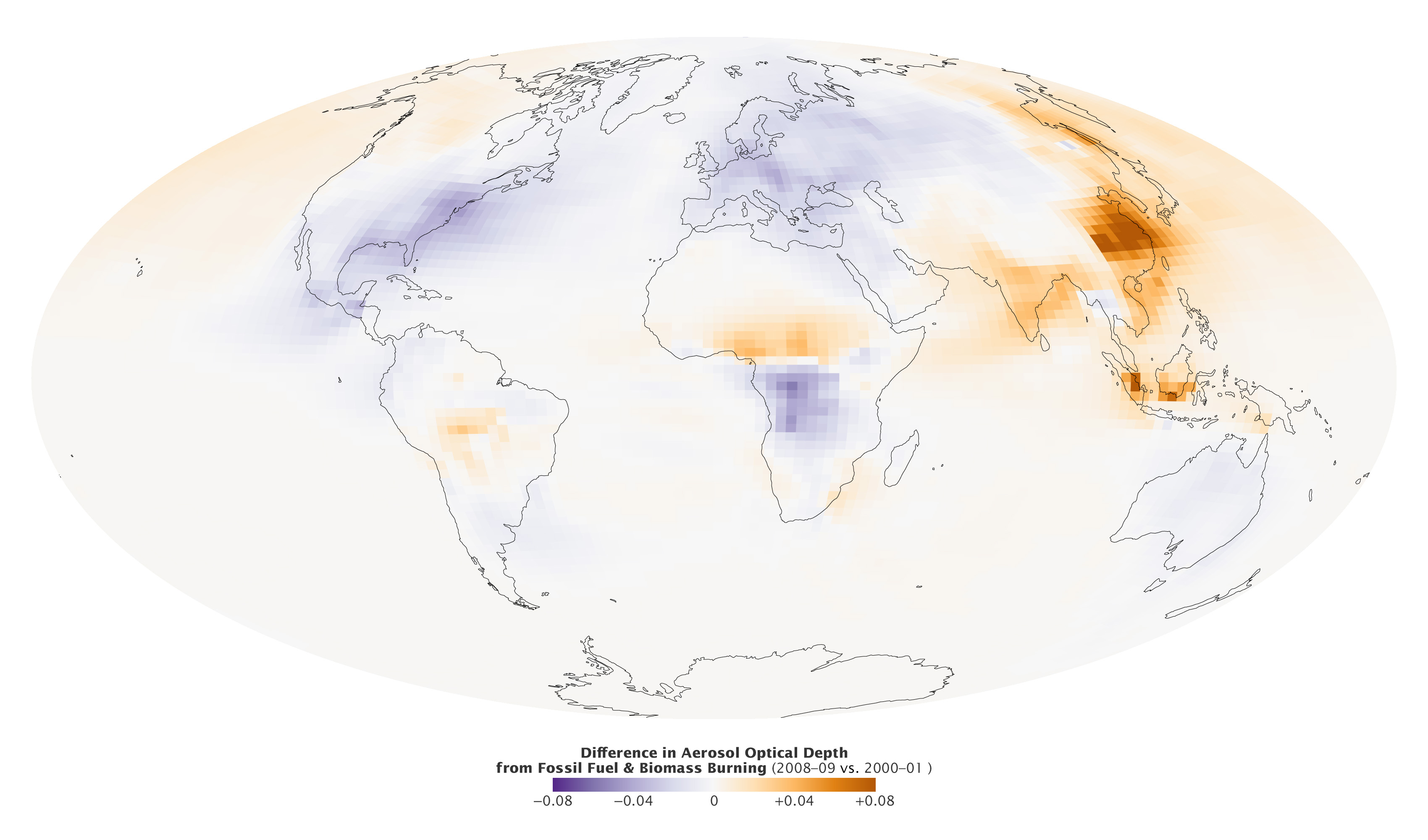
The map above illustrates some of the key trends seen in the global distribution of anthropogenic (human-caused) aerosols between 2000–01 and 2008–09. Areas where aerosol levels increased are shown in orange; areas where they decreased are blue. The map—first published in 2014 as part of a study in Atmospheric Chemistry and Physics—shows levels of anthropogenic aerosols decreasing significantly over much of Europe and eastern North America. On the other hand, it shows significant increases over Asia.
Asian countries, particularly China and India, have been releasing more particulate matter into the air as they urbanize, while European countries and the United States of America have seen pollution levels decline as more efficient, cleaner-burning technologies have become more widespread. Note: the trends seen in Africa are not related to emissions of industrial air pollution. Air is this part of the world is heavily influenced by smoke from agricultural burning, which varies depending on weather conditions.
The data used to create the map came from the Goddard Chemistry Aerosols Radiation and Transport Model (GOCART), a computer model that incorporates emissions inventories and meteorological data to simulate how different types of aerosols behave in the atmosphere over time. While a variety of human activities can result in the emission of aerosols, this particular simulation focuses on aerosols emitted by burning fossil fuels and biomass, two common sources of anthropogenic aerosols. Changes in the distribution of natural aerosols (dust, volcanic ash, and sea salt) were not included in the map, though they were during other runs of the model. Since scientists often compare the results of GOCART simulations with data collected by satellites, the data is presented in terms of aerosol optical depth.
Read “The Global View of Air Pollution” to find out more about air quality and how it has changed around the world in recent decades.
NASA Earth Observatory map by Robert Simmon, based on data from the Goddard Chemistry Aerosol Radiation and Transport (GOCART) model. Caption by Adam Voiland, with information from Mian Chin.